Examples of how to make Drupal "outside-in"
The authoring experience improvements we made in Drupal 8 appear to be well-received, but that doesn't mean we are done. With semantic versioning in Drupal 8, we can now make more UX changes in follow-up releases of Drupal 8. So now is a good time to start moving Drupal's user experience forward.
The goal of this post is to advance the conversation we started over a month ago in a blog post talking about the concept of turning Drupal outside-in. In today's blog post, we'll show concrete examples of how we could make site building in Drupal easier by embracing the concept of outside-in. We hope to provide inspiration to designers, core contributors and module maintainers for how we can improve the user experience of Drupal 8.2 and beyond.
What is outside-in?
In Drupal you often have to build things from the ground up. If you want to make a list of events you need to wade through 20 different menu options to a user interface with configuration options like "boolean" and "float", build a content type, content, and then a view. Essentially you need to understand everything before you can build anything.
In an "outside-in" experience – or what Kevin OLeary (Director of Design on my team at Acquia) calls Literal UI – you can click anything on the page, edit its configuration in-place, and watch it take effect immediately.
Over the past few years Drupal has adopted a more outside-in approach, the most obvious example being Drupal 8's in-place editing. It enables you to edit what you see with an uninterrupted workflow, faster preview, and removes the need to visit the administration backend before you can start editing.
To evaluate how outside-in can be applied more broadly in order to make Drupal easier to use, Kevin created a few animated gifs.
Example #1: editing menu items
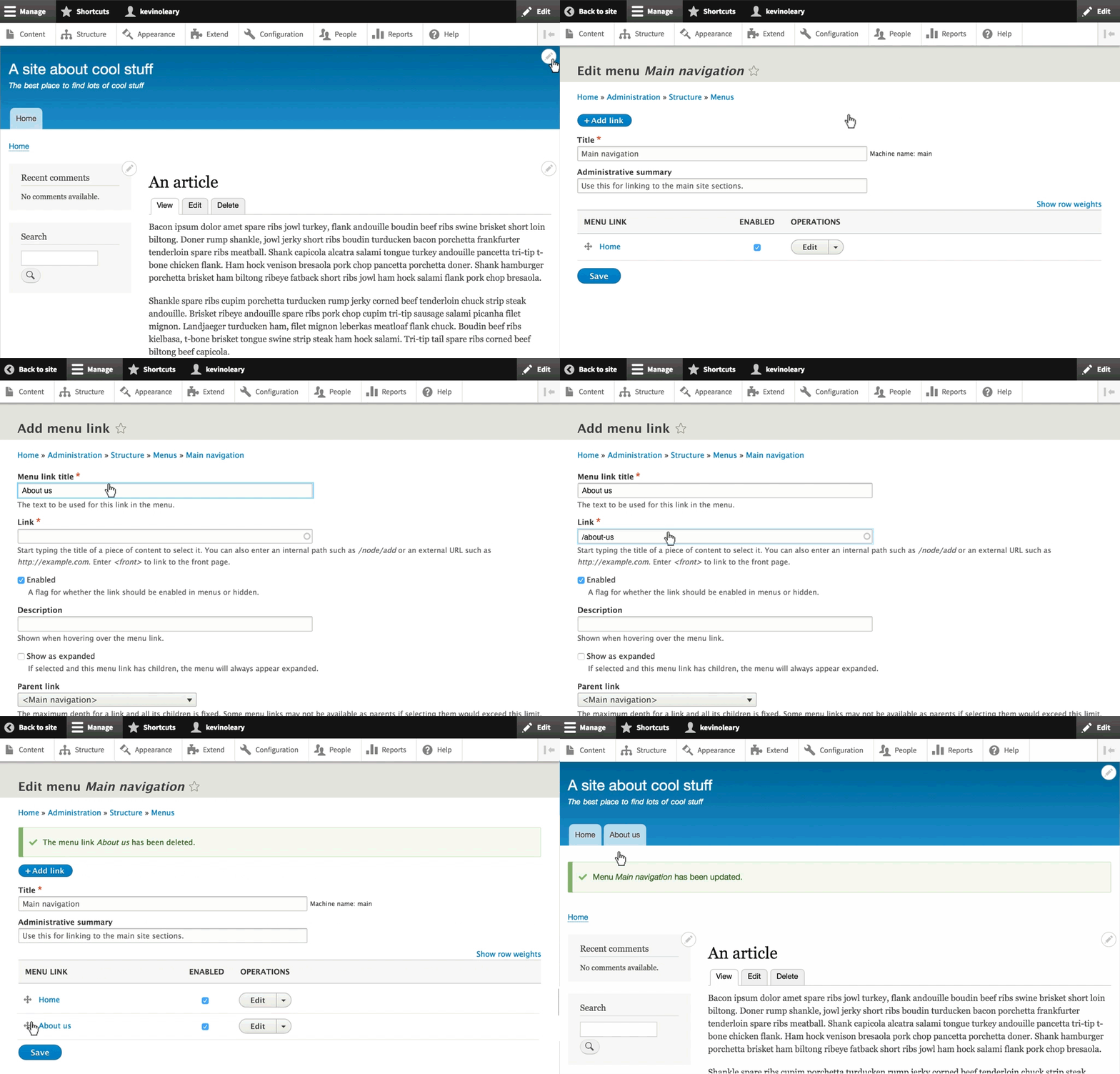
The current inside-out experience
Editing menu options in Drupal has already become more outside-in with contextual links. The contextual links take away some of the guesswork of finding the proper administration UI, but once you arrive at the configuration page there is still a lot of stuff to take in, only some of which is relevant to this task.

Anyone familiar with Drupal will recognize the pattern above; you go to an administration UI, make some changes, than you go back to the page to see if it worked. This context switching creates what UX people call "cognitive load". On an administration page you need to remember what was on the site page and vice-versa.
To complete this task you need to:
- Find the contextual link for the menu (not simple since it's on the far side of the page)
- Choose the correct option "edit menu"
- Find and click the "add link" button
- Type the menu link name
- Type the menu link path beginning with a forward slash
- Understand that this change needs to be saved
- Scroll to the bottom of the page
- Save the link
- Find the link in the list of links
- Understand that dragging up/down in this abstraction is equivalent to moving right/left in that actual page
- Scroll to the bottom of the page
- Save the menu
The problem is not just that there are too many pages, clicks, or words, it's that each step away from the actual page introduces new opportunities for confusion, error and repetition. In user testing, we have seen users who were unable to find the contextual link, or to understand which option to choose, or to find the "add link" button, or to add a path, or drag-drop links, or to save before leaving the UI. When these things happen in context, feedback about whether you are "doing it right" is immediate.
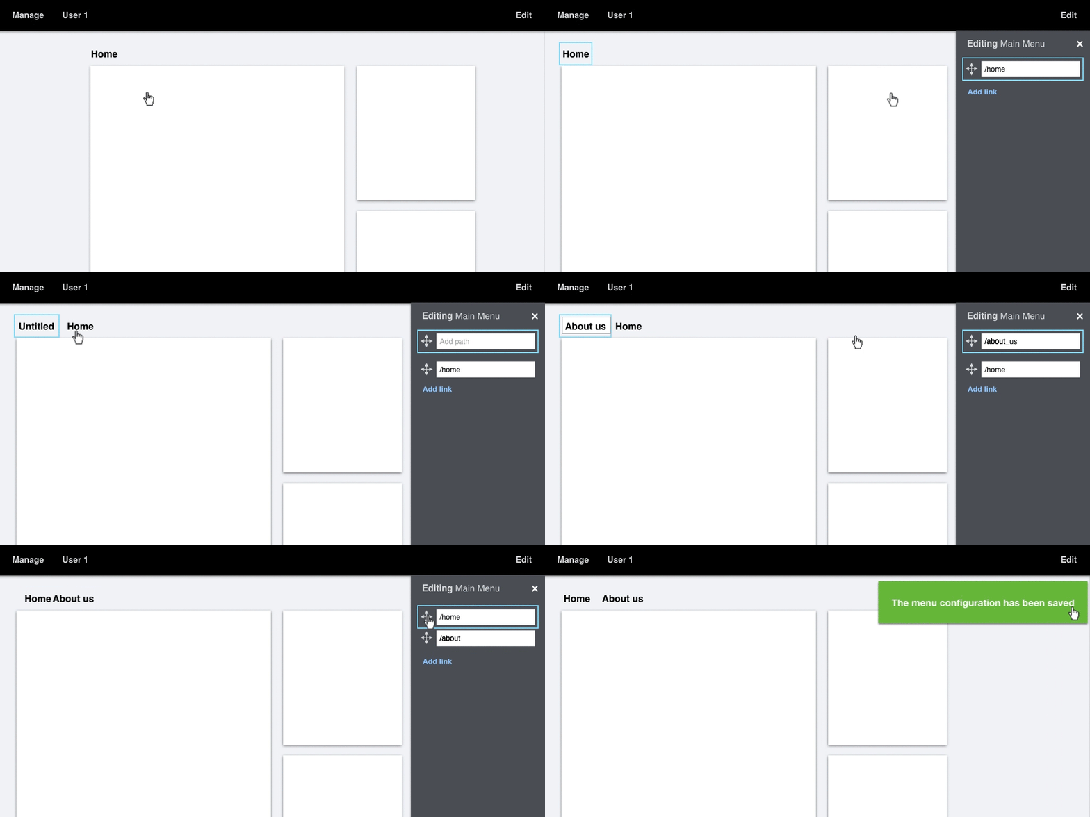
The proposed outside-in experience

Now all you need to do is:
- Click the menu on the page
- Find and click the "add link" button
- Type the name of the menu item
- Revise the menu item's path if needed
- Drag the link to its new location
- Close the drawer
One important aspect of this approach is that all actions that produce a visible change have bi-directional control and bi-directional feedback. In other words, if you can drag something in the configuration drawer you should also be able to drag it on the page, and the changes should happen simultaneously.
Example #2: adding a block to a page
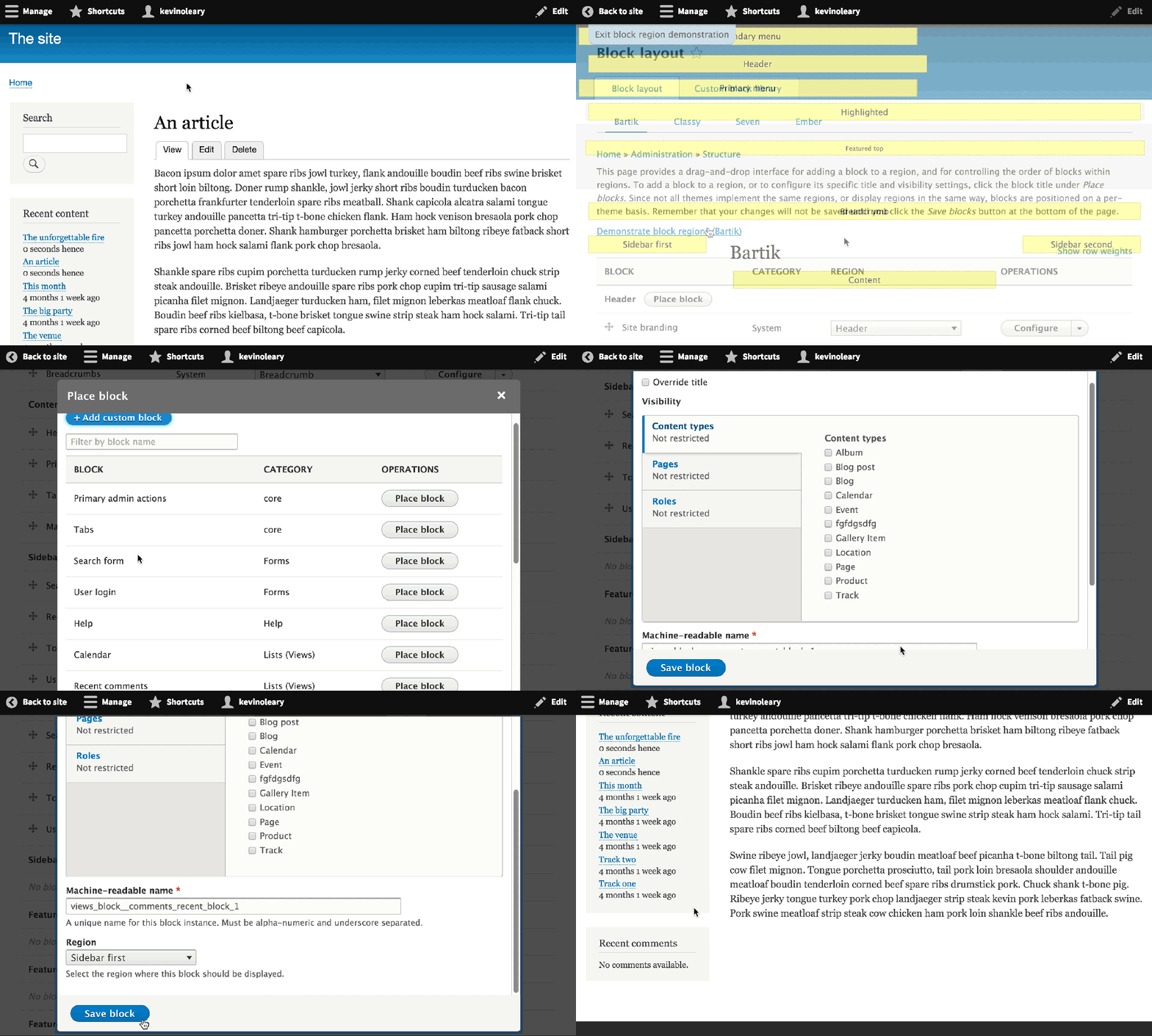
The current inside-out experience
The process of placing a block on a page can be difficult. Once you discover where to go to add a block, which is in itself a challenge, the experience requires a lot of reading and learning, as well as trial and error.

To complete this task you need to:
- Figure out where to go to place a block
- Go to /block-layout
- Go to /display-regions to find out where the region is on the page
- Go back to /block-layout
- Find the region and click "add block"
- Find the block you want to place and click "place block"
- Configure the block
- Read about how blocks can appear on multiple pages and for different content types and roles
- Read what content types are
- Read what roles are
- Read what a "path" is
- Read how to find the path for a page
- Go back to the page and get its path
- Go back to /block-layout and add the path to the visibility settings
- Drag your block to the position where you want it
- If your blocks are arranged horizontally, learn that "up and down" in the block layout UI will mean "left and right" on the actual page
- Find the"back to site" link
- Go back to the page to see if you did it right
Eventually you'll use what you just learned, but Drupal makes you learn it first instead of just showing what is immediately necessary. Both the task and the learning can be simplified by bringing the configuration closer to the object you are configuring.
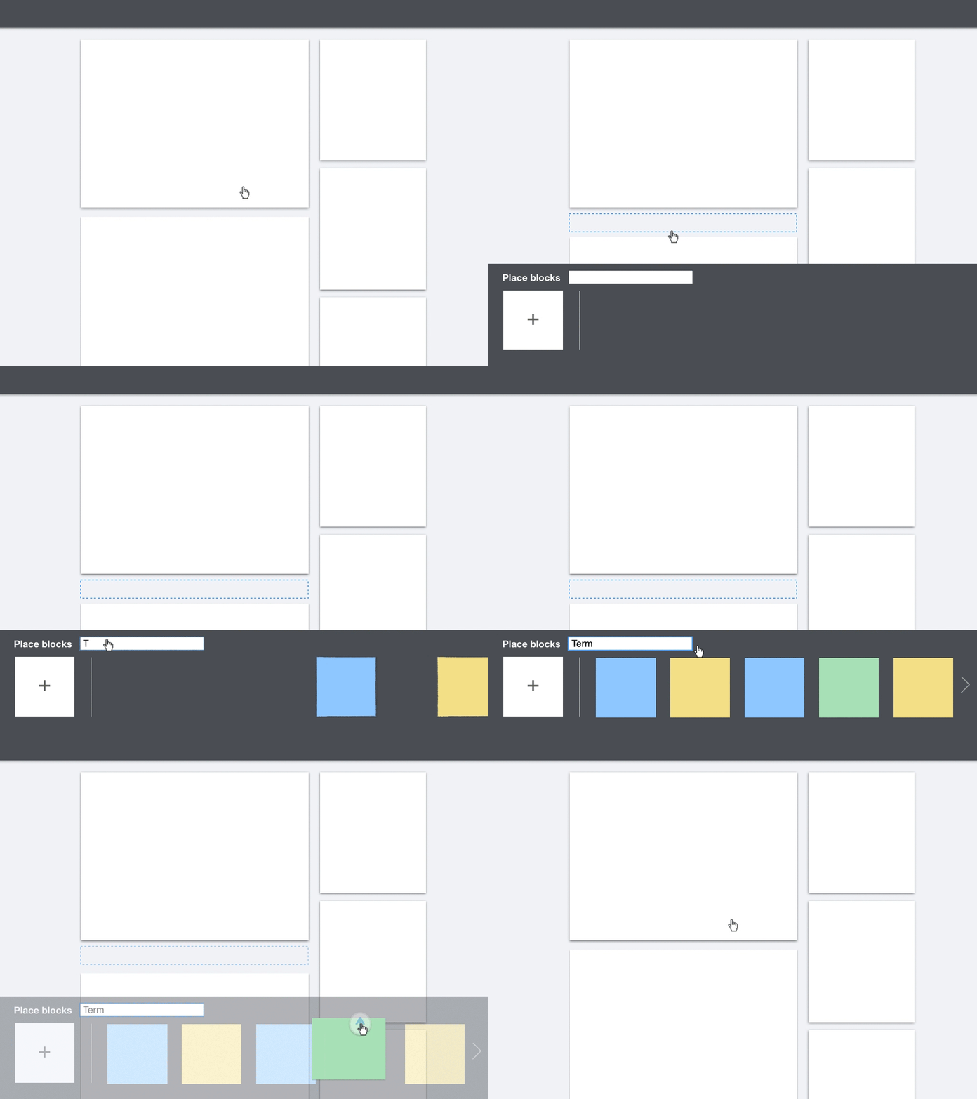
The proposed outside-in experience

Now all you need to do is:
- Choose where to place the block
- Find the block you want to place
- Place the block
- Close the drawer
The "plus" button, the drop target (blue dotted rectangle) and the autocomplete are all commonly understood patterns used by other software. The task requires no or little explanation as the interactions reveal the process. By starting with selecting the location of where to place the block, we avoid the need for drag-and-drop and the complexity of dragging a block on a page that requires scrolling.
Principles and patterns
These examples show the principle that rather than taking the site builder to a separate administration backend, the experience should begin with the actual page and show how the changes will be seen by the end-user. The patterns shown here are less important. For example, the animated gifs above show two different approaches to the options panel and there are certainly others. The important thing is not yet where the panel comes from or how it looks, but that the following criteria are met:
- An option panel is triggered by direct interaction.
- When triggered it only shows options for what you selected.
- It primarily shows configuration options that produce a visible change to the page. More complex options could be accessed through an 'Advanced options' link.
The ideas in this post are meant to provide some food for thought and become the seed of some patches for Drupal 8.2. Rather than dive right into development, we're looking to the Drupal community to take these designs as a starting point to prototype and user-test more outside-in experiences in Drupal.
The next post in this series will cover outside-in experiences with more complex contexts and the problem of "leaky abstractions". If you don't want to miss the next blog post, make sure to subscribe. In the mean time, I'd love to hear what you think!
Special thanks to Kevin OLeary for advocating outside-in thinking. Thanks to Preston So, Gábor Hojtsy, Angie Byron, Bojhan Somers and Roy Scholten for their feedback.
— Dries Buytaert
Dries Buytaert is an Open Source advocate and technology executive. More than 10,000 people are subscribed to his blog. Sign up to have new posts emailed to you or subscribe using RSS. Write to Dries Buytaert at dries@buytaert.net.