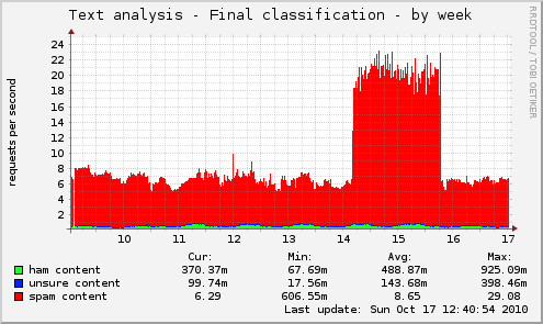
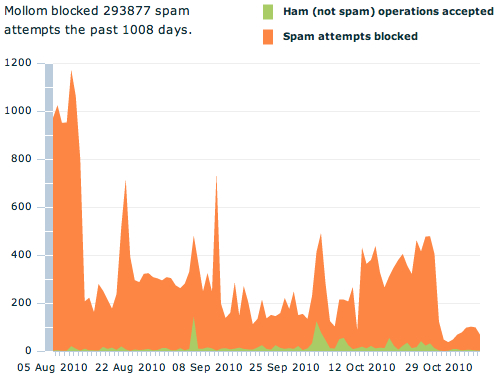
The Y-axis shows the number of requests per second. The X-axis shows the day of the month. The graph is for one Mollom server only.
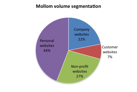
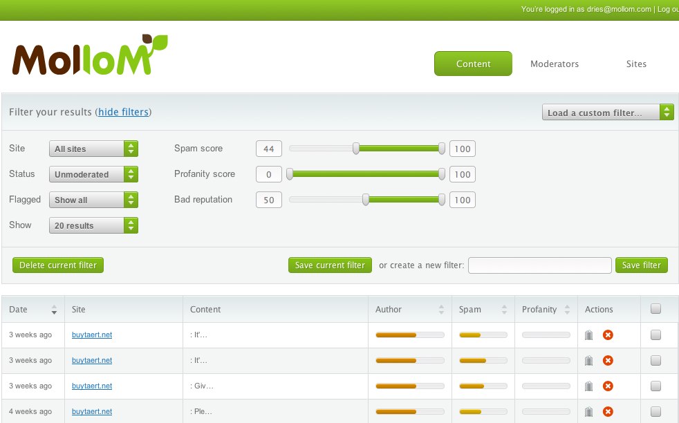
Based on a sample of roughly 2,000 Drupal sites that use Mollom.
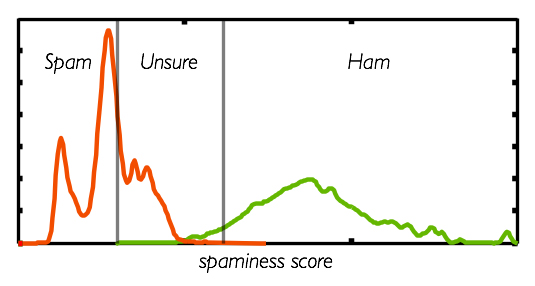
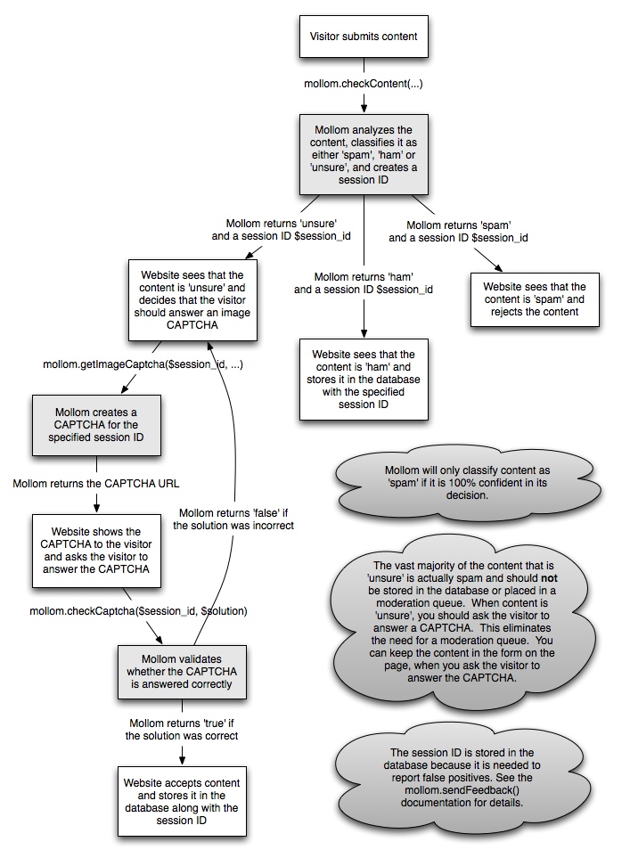
The plot illustrates that having a classifier with three states avoids false positives and false negatives. The plot is generated from the actual data in Mollom's database.
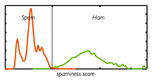
The plot illustrates that having a binary classifier with only two states (ham and spam) is bound to make mistakes. The plot is generated from the actual data in Mollom's database.
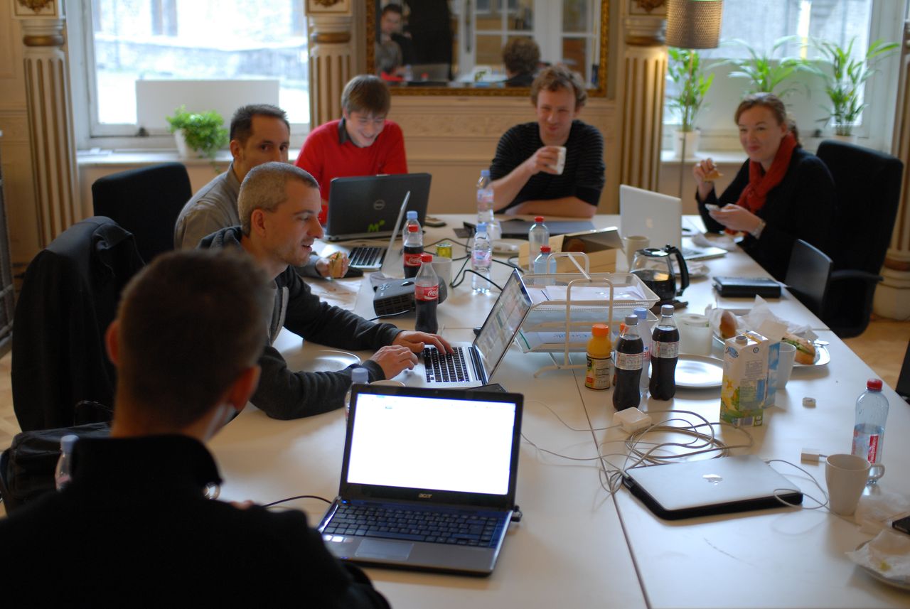
A photo of the Mollom team at an offsite in 2011: it includes Daniel Kudwien, Benjamin Schrauwen, Cedric De Vleeschauwer, Thomas Meire, Johan Vos and Vicky Van Roeyen. Missing in the picture is Dries.
Selling Mollom to Acquia involved signing a lot of documents. A photo of me signing the acquisition paperwork with Mary Jefts, Acquia's CFO at the time. It took three hours to sign all the paperwork.


