Rebirthing Acquia.com
If you're a regular visitor to the Acquia website, you were probably surprised at what you saw the last time you stopped by. Aside from our new company logo, the whole site has a very different look, navigation, and main message points from a few days ago. This is the result of a project that has kept our marketing teams busy for the last few months.
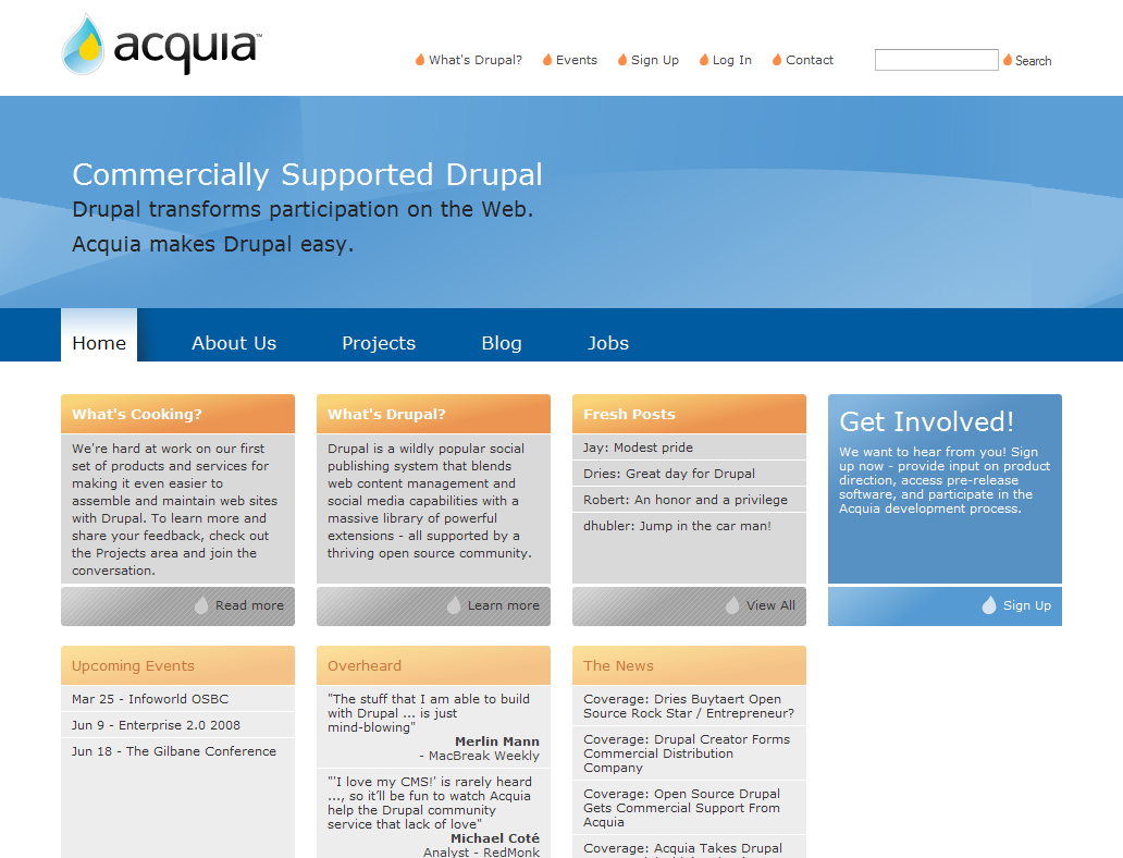
Although this design represents the most profound website changes in the company's history, it's not the first time we've done this. Here is what our initial website looked like in 2008:

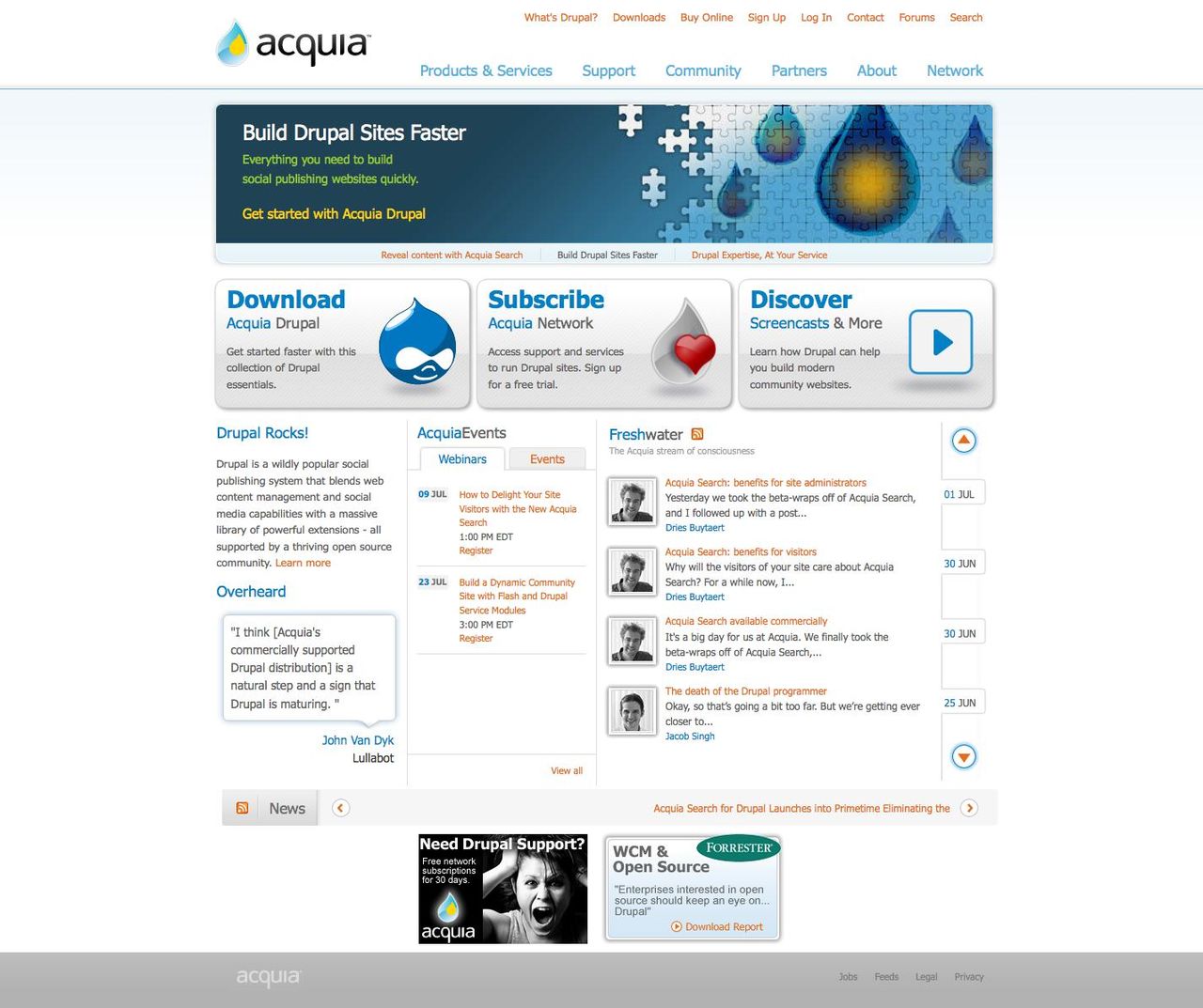
... and in 2009:

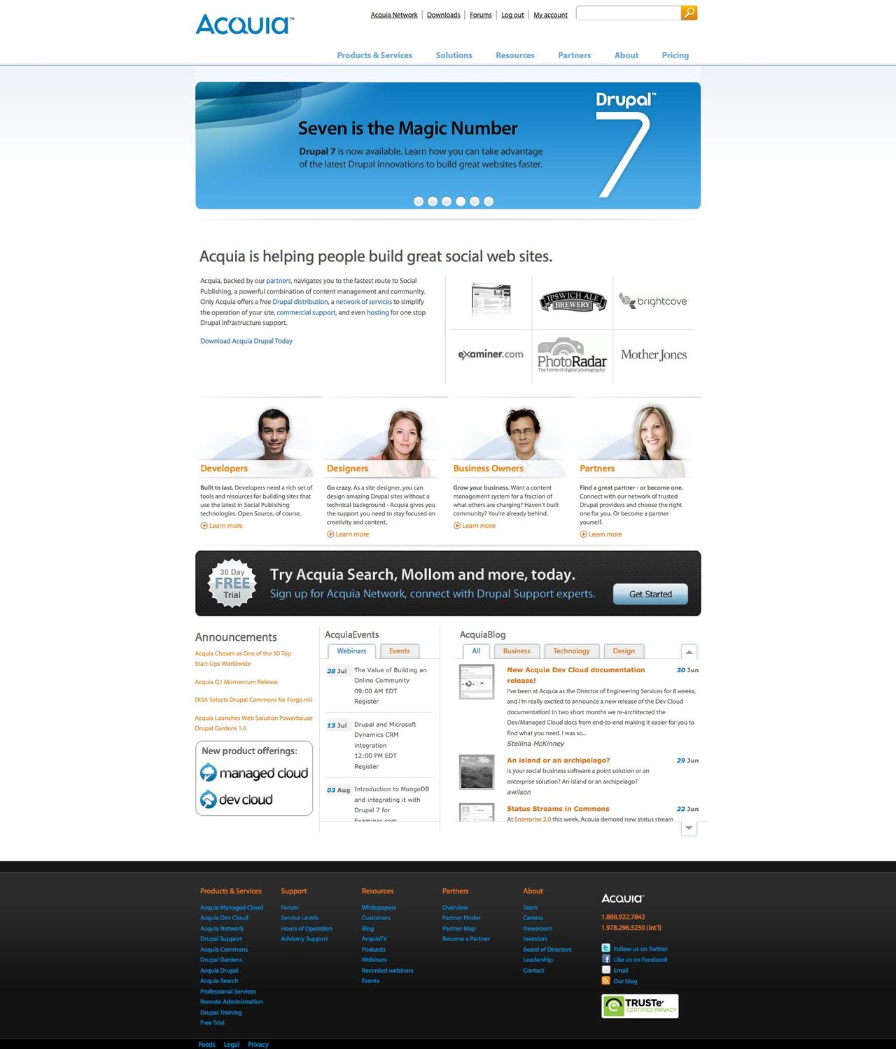
... and until this week:

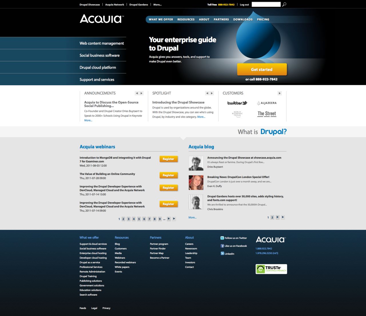
Finally, here it is today:

Aside from obvious visual changes, we've tried to explain Acquia's products and services better. The experiences of the last three and a half years have shown us what people want from us, what we do well, and how to best match the two. I don't think we could have made our site so clear a year ago, and can only imagine what refinements future revisions will bring.
—