Redesigning a website using CSS Grid and Flexbox
For the last 15 years, I've been using floats for laying out a web pages on dri.es. This approach to layout involves a lot of trial and error, including hours of fiddling with widths, max-widths, margins, absolute positioning, and the occasional calc() function.
I recently decided it was time to redesign my site, and decided to go all-in on CSS Grid and Flexbox. I had never used them before but was surprised by how easy they were to use. After all these years, we finally have a good CSS layout system that eliminates all the trial-and-error.
I don't usually post tutorials on my blog, but decided to make an exception.
What is our basic design?
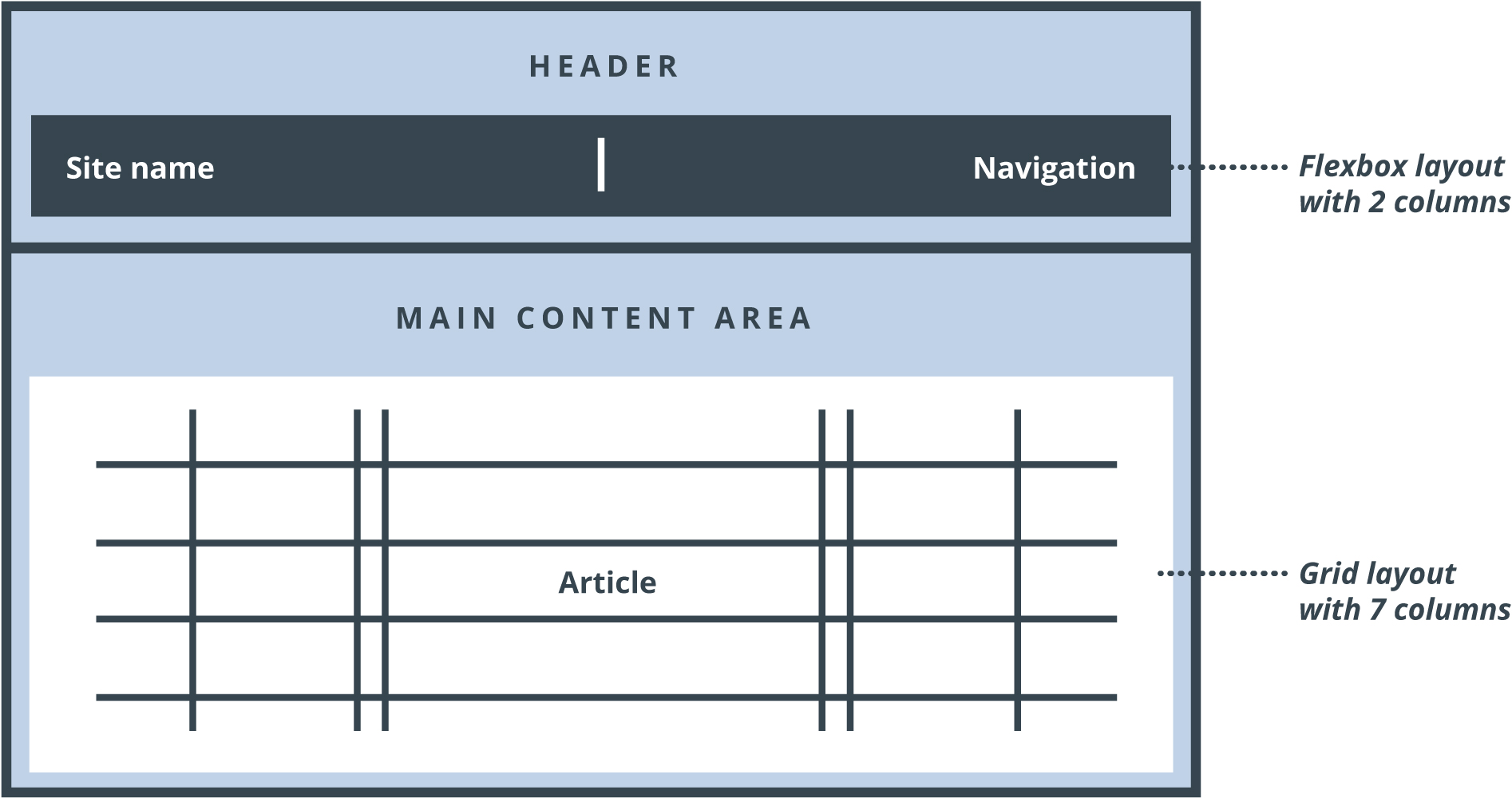
The overall layout of the homepage for dri.es is shown below. The page consists of two sections: a header and a main content area. For the header, I use CSS Flexbox to position the site name next to the navigation. For the main content area, I use CSS Grid Layout to lay out the article across 7 columns.
Creating a basic responsive header with Flexbox
Flexbox stands for the Flexible Box Module and allows you to manage "one-dimensional layouts". Let me further explain that by using an real example.
Defining a flex container
First, we define a simple page header in HTML:
<div id="header">
  <div class="title">Site title</div>
  <div class="navigation">Navigation</div>
</div>
To turn this in to a Flexbox layout, simply give the container the following CSS property:
#header {
  display: flex;
}
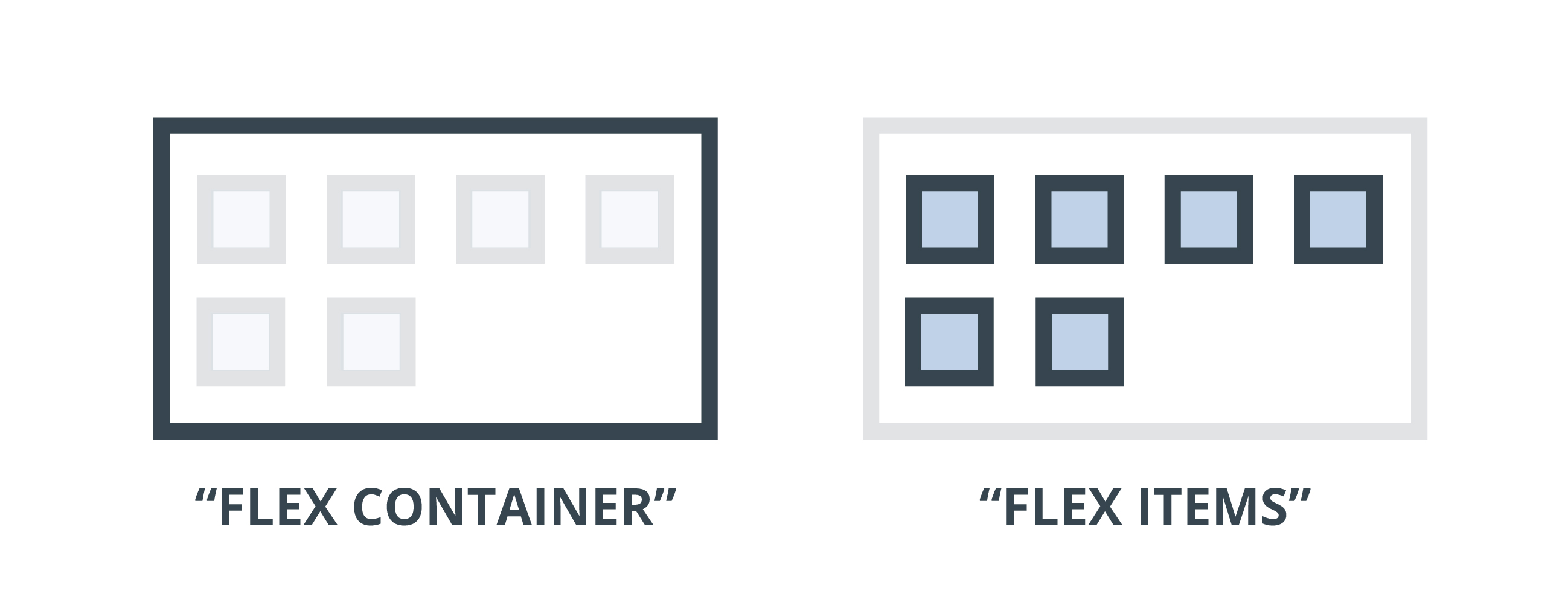
By setting the display property to flex, the #header element becomes a flex container, and its direct children become flex items.
Setting the flex container's flow
The flex container can now determine how the items are laid out:
#header {
  display: flex;
  flex-direction: row;
}
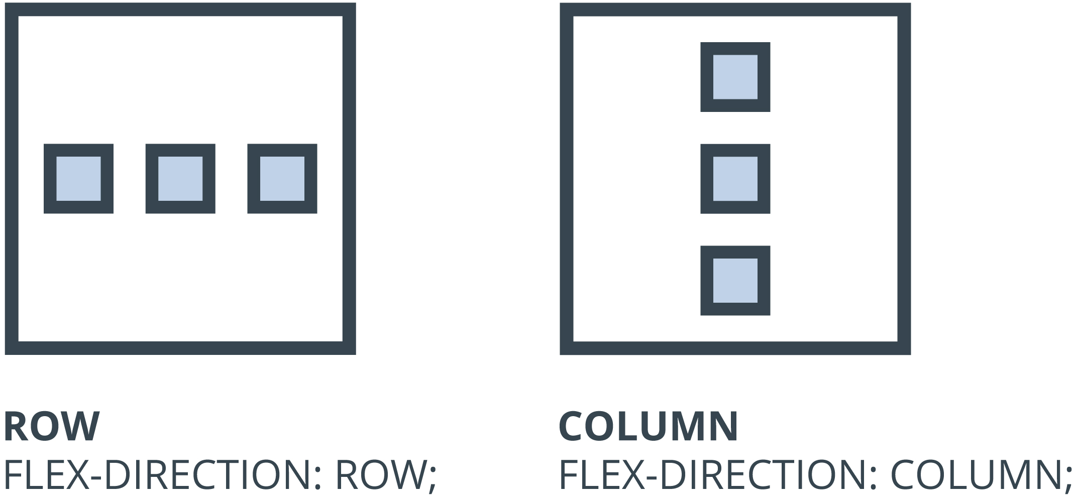
flex-direction: row; will place all the elements in a single row:

And flex-direction: column; will place all the elements in a single column:

This is what we mean with a "one-dimensional layout". We can lay things out horizontally (row) or vertically (column), but not both at the same time.
Aligning a flex item
#header {
  display: flex;
  flex-direction: row;
  justify-content: space-between;
}
Finally, the justify-content property is used to horizontally align or distribute the Flexbox items in their flex container. Different values exist but justify-content: space-between will maximize the space between the site name and navigation. Different values exist such as flex-start, space-between, center, and more.

Making a Flexbox container responsive
Thanks to Flexbox, making the navigation responsive is easy. We can change the flow of the items in the container using only a single line of CSS. To make the items flow differently, all we need to do is change or overwrite the flex-direction property.
To stack the navigation below the site name on a smaller device, simply change the direction of the flex container using a media query:
@media all and (max-width: 900px) {
  #header {
    flex-direction: column;
  }
}
On devices that are less than 900 pixels wide, the menu will be rendered as follows:

Flexbox make it really easy to build responsive layouts. I hope you can see why I prefer using it over floats.
Laying out articles with CSS Grid
Flexbox deals with layouts in one dimension at the time ― either as a row or as a column. This is in contrast to CSS Grid Layout, which allows you to use rows and columns at the same time. In this next section, I'll explain how I use CSS Grid to make the layout of my articles more interesting.
For our example, we'll use the following HTML code:
<article>
  <h1>Lorem ipsum dolor sit amet</h1>
  <p class="description">Sed ut perspiciatis unde omnis iste natus error sit voluptatem accusantium doloremque laudantium.</p>
  <p>Lorem ipsum dolor sit amet, consectetur adipiscing elit, sed do eiusmod tempor incididunt ut labore et dolore magna aliqua. Ut enim ad minim veniam, quis nostrud exercitation ullamco laboris nisi ut aliquip ex ea commodo consequat.</p>
  <figure class="right">
   <img src="./image.jpg">
   <figcaption>Duis aute irure dolor in reprehenderit in voluptate velit esse cillum dolore eu fugiat nulla pariatur.</figcaption>
  </figure>
  <p>Sed ut perspiciatis unde omnis iste natus error sit voluptatem accusantium doloremque laudantium, totam rem aperiam, eaque ipsa quae ab illo inventore veritatis et quasi architecto beatae vitae dicta sunt explicabo. Nemo enim ipsam voluptatem quia voluptas sit aspernatur aut odit aut fugit, sed quia consequuntur magni dolores eos qui ratione voluptatem sequi nesciunt.</p>
  <footer>
    Some meta data
    Some meta data
    Some meta data
  </footer>
</article>
Simply put, CSS Grid Layout allows you to define columns and rows. Those columns and rows make up a grid, much like an Excel spreadsheet or an HTML table. Elements can be placed onto the grid. You can place an element in a specific cell, or an element can span multiple cells across different rows and different columns.
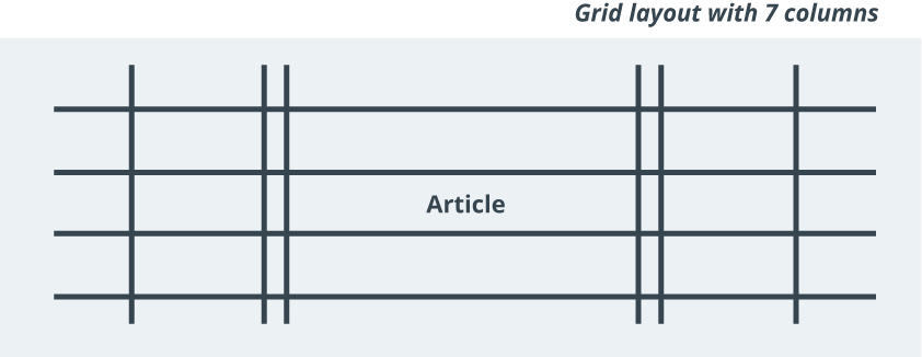
We apply a grid layout to the entire article and give it 7 columns:
article {
  display: grid;
  grid-template-columns: 1fr 200px 10px minmax(320px, 640px) 10px 200px 1fr;
}
The first statement, display: grid, sets the article to be a grid container.
The second statement grid-template-columns defines the different columns in our grid. In our example, we define a grid with seven columns. The middle column is defined as minmax(320px, 640px), and will hold the main content of the article. minmax(320px, 640px) means that the column can stretch from 320 pixels to 640 pixels, which helps to make it responsive.
On each side of the main content section there are three columns. Column 3 and column 5 provide a 10 pixel padding. Column 2 and columns 6 are defined to be 200 pixels wide and can be used for metadata or for allowing an image to extend beyond the width of the main content.
The outer columns are defined as 1fr, and act as margins as well. 1fr stands for fraction or fractional unit. The width of the factional units is computed by the browser. The browser will take the space that is left after what is taken by the fixed-width columns and divide it by the number of fractional units. In this case we defined two fractional units, one for each of the two outer columns. The two outer columns will be equal in size and make sure that the article is centered on the page. If the browser is 1440 pixels wide, the fixed columns will take up 1020 pixels (640 + 10 + 10 + 180 + 180). This means there is 420 pixels left (1440 - 1020). Because we defined two fractional units, column 1 and column 2 should be 210 pixels wide each (420 divided by 2).
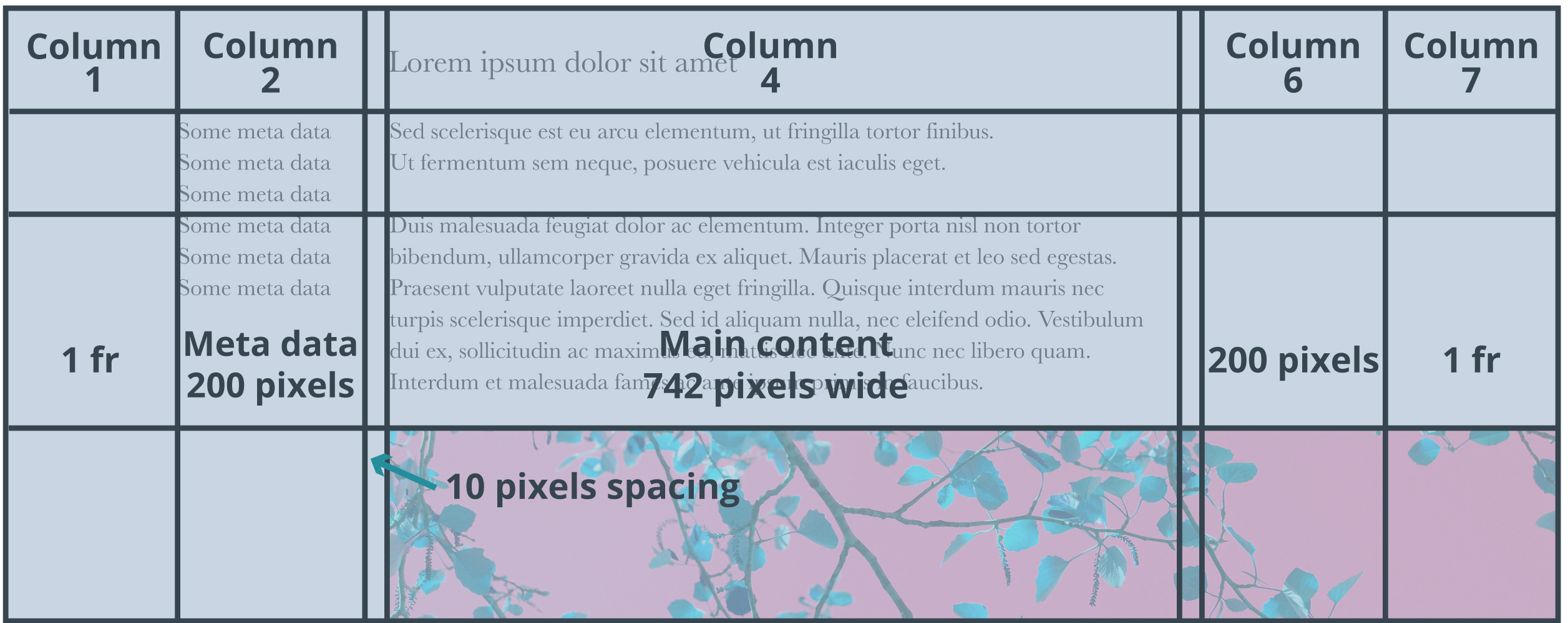
While we have to explicitly declare the columns, we don't have to define the rows. The CSS Grid Layout system will automatically create a row for each direct child of our grid container article.
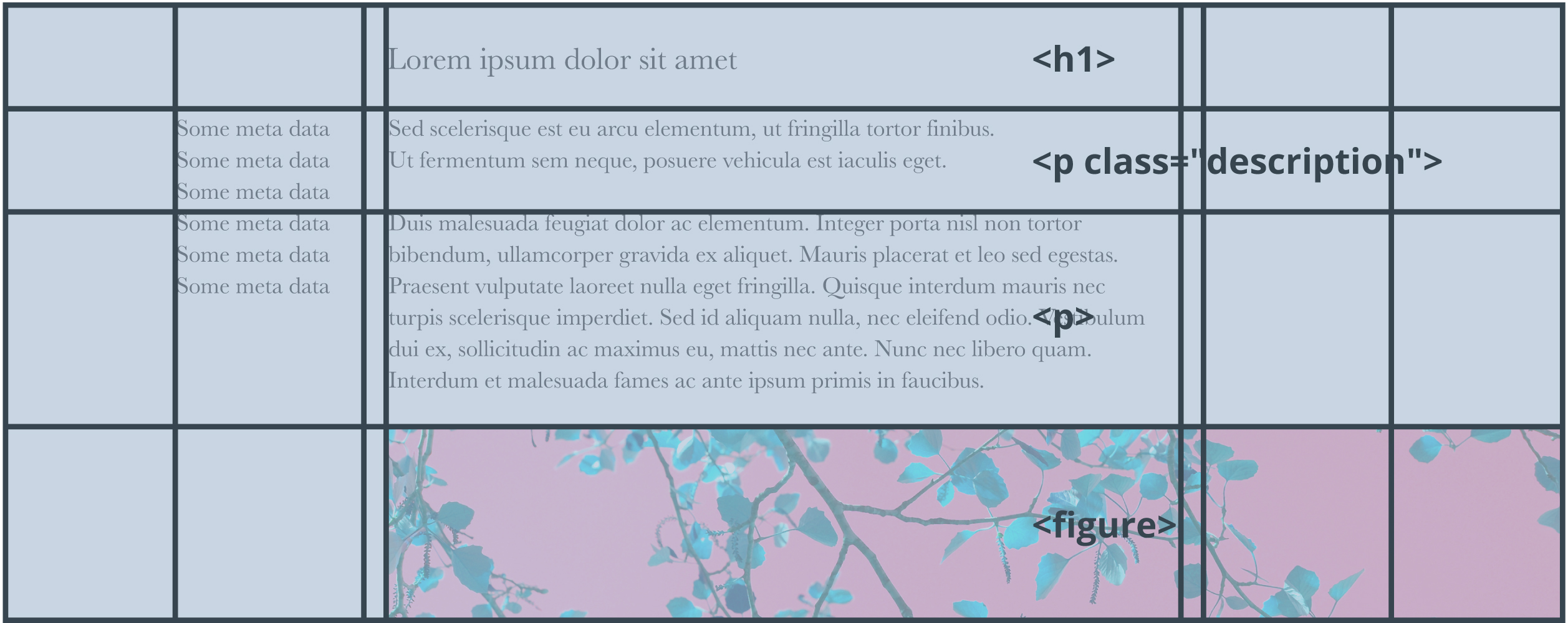
Now we have the grid defined, we have to assign content elements to their location in the grid. By default, the CSS Grid Layout system has a flow model; it will automatically assign content to the next open grid cell. Most likely, you'll want to explicitly define where the content goes:
article > * {
  grid-column: 4 / -4;
}
The code snippet above makes sure that all elements that are a direct child of article start at the 4th column line of the grid and end at the 4th column line from the end. To understand that syntax, I have to explain you the concept of column lines or grid lines:
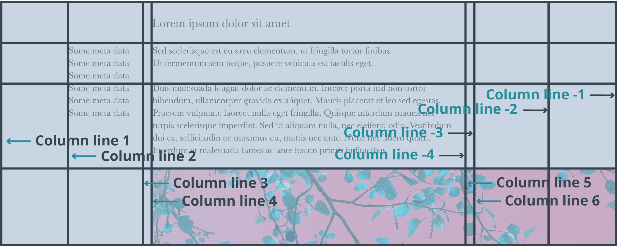
By using grid-column: 4 / -4, all elements will be displayed in the "main column" between column line 4 and -4.
However, we want to overwrite that default for some of the content elements. For example, we might want to show metadata next to the content or we might want images to be wider. This is where CSS Grid Layout really shines. To make our image take up the entire width we'll just tell it span from the first to the last column line:
article > figure {
  grid-column: 1 / -1;
}
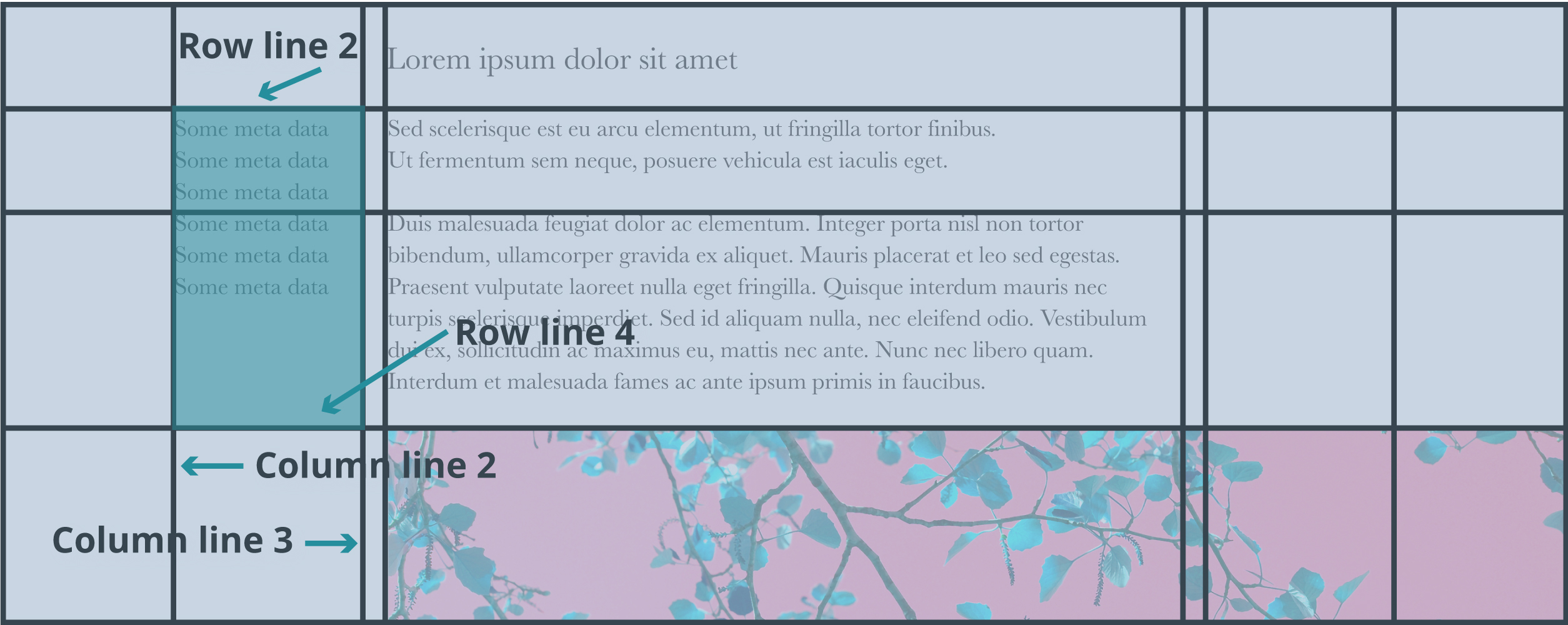
To put the metadata left from the main content, we write:
#main article > footer {
  grid-column: 2 / 3;
  grid-row: 2 / 4;
}
I hope you enjoyed reading this tutorial and that you are encouraged to give Flexbox and Grid Layouts a try in your next project.
—