Drupal 7 usability: status update
Based on a survey that I conducted last year, it was clear that one of the community's key goals is making Drupal easier to use. This is not really all that surprising. An easier to use Drupal means a Drupal that attracts more users, and therefore more potential contributors. It also means existing contributors spend less time doing custom work on their sites or developing training materials to help make Drupal palatable to their clients, and more time on making Drupal rock. And finally, it is strategically important for the future of the Drupal project to make our usability match the prowess of our flexible APIs; our competitors are working to build out their feature set to match Drupal's, and if we do not work to make Drupal's usability radically better, we risk falling victim to The Ockham's Razor Principle of Content Management Systems.
In this post, I want to give an update on the Drupal 7 usability work that has been done to date.
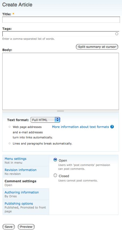
The good news is that thanks to the hard work of many people in the community, a lot of great Drupal usability improvements have already gone into Drupal 7. For example, we improved support for WYSIWYG editors, added more drag-and-drop, improved administration of permissions, added a default install profile which starts to configure some sensible defaults for Drupal as a publishing system, improved the password strength validator, redesigned and simplified various configuration pages, implemented "vertical tabs" on content creation and editing forms (see screenshot below), removed extraneous interface text, and much more.
The more important trend, however, is that after years of tireless evangelizing, the Drupal community is starting to value usability increasingly more. Today, the Drupal Usability Team is more involved in the patch review process than ever before – for example, Bojhan, a usability expert active in Drupal's usability team, has even learned how to create patches so that he can help make simple changes. Another good example, is that in the Drupal 7 development cycle, we have raised money to do formal usability testing. These efforts illustrate a fundamental underlying desire to get better at usability, so I expect to see even more great things in the months to come.

All this is great work that helps address some of Drupal's fundamental problems; however, a lot of these improvements are incremental – making incremental improvements is what the Drupal community excels at. Making the drastic over-arching improvements to Drupal's ease of use that we really need for Drupal to grow its audience requires one to step back, take a fresh look at the big picture, interview people, analyze problems, and propose more radical changes that incorporate piles of feedback and ideas. Needless to say, this is a long and expensive process, and not something we'd be able to get to using incremental changes. An objective without strategy remains a dream so as I announced in February 2009, I thought it would be right for Acquia to finance Mark Boulton and Leisa Reichelt to help the Drupal community with exactly this.
For about 3 months now, Mark and Leisa have been working with the Drupal usability group and the larger Drupal community to figure out how we can improve the usability of Drupal 7. I figured an update was in order.
Mark and Leisa's work is being done in an open, collaborative, and transparent way, involving everyone in the Drupal community. The work is happening in a number of locations, and the best place to keep track of it all is at D7UX.org. Mark and Leisa also often hang out with the usability team on #drupal-usability on irc.freenode.net, and even have been known to venture into #drupal and #drupal-dev.
Some of the activities to date have included some 'blue sky design workshops' with community members at DrupalCon DC, one-on-one interviews with members of the the Drupal community and potential future Drupal users, and more. As the work has progressed they have shared work in progress on Flickr, conducted user testing on those prototypes, and much more.

In addition to paying Mark and Leisa, Acquia has contributed some of its own internal engineering resources. Jeff Noyes, Jason Reed (both senior designers) and myself traveled to meet with Mark and Leisa in London – we flew in Yoroy, a key contributor to Drupal usability, to attend as well. We locked ourselves in a room for two days, and discussed and validated early design prototypes. You can read a summary of the visit on Jeff Noyes's site. Returning home from London, I couldn't be happier, because the designs and prototypes started to live up my vision and expectations of how easy to use Drupal could be.
Since then, Mark and Leisa have revised many of their prototypes based on the feedback that was provided, and continues to be provided by the larger Drupal community. They aren't finished yet, but Mark and Leisa will be helping us until the end of July. Expect more mockups, working prototypes and lots of user testing and iterations. Eventually, we should also have some style guides.
However, beautiful usability improvements are no good to anyone unless they have code behind them. In my next blog post, I'll write about the next steps, and how we can all help translate these mockups into working code.
—