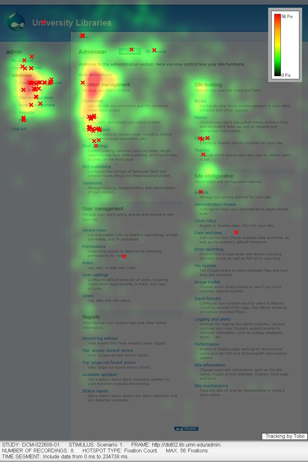
First results from usability testing
Two weeks ago, we conducted formal usability testing for Drupal at the University of Minnesota Office for Information Technology's usability lab. As I wrote earlier, the university has a professional usability lab that allowed us to record eye-tracking data and video.

The blue dot in the video shows what the user is looking at on Drupal's user account creation page. Several users backed out in a panic because they thought they caused an error condition due to the red text.
Seeing users consistently fail at what we consider to be basic tasks (e.g. creating a new content type or adding a new user account) is a true eye opener. Let's be clear about this: this is Drupal's fault, not the users' fault. The good news is that we came out of this with a long list of usability problems that we can fix.
In fact, the Drupal team that participated in Minnesota tried to process much of the data prior to our DrupalCon Boston presentation on usability testing: check out our preliminary report from the usability testing (PDF, 6MB) or participate in the Drupal usability group where more information and results will be made available.
Massive thanks to Chad and Cody of the University of Minnesota for making this possible, and a big thumbs up for all the Drupal participants that are committed to making Drupal easier to use. Let's start addressing those problems!
—