Refreshing the Drupal administration UI
A modern and fresh look is coming to the Drupal administration interface soon. Take a look!
Last year, I talked to nearly one hundred Drupal agency owners to understand what is preventing them from selling Drupal. One of the most common responses raised is that Drupal's administration UI looks outdated.
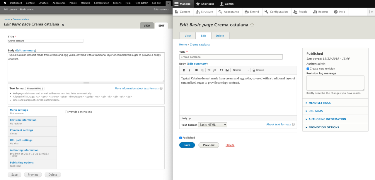
This critique is not wrong. Drupal's current administration UI was originally designed almost ten years ago when we were working on Drupal 7. In the last ten years, the world did not stand still; design trends changed, user interfaces became more dynamic and end-user expectations have changed with that.
To be fair, Drupal's administration UI has received numerous improvements in the past ten years; Drupal 8 shipped with a new toolbar, an updated content creation experience, more WYSIWYG functionality, and even some design updates.

While we made important improvements between Drupal 7 and Drupal 8, the feedback from the Drupal agency owners doesn't lie: we have not done enough to keep Drupal's administration UI modern and up-to-date.
This is something we need to address.
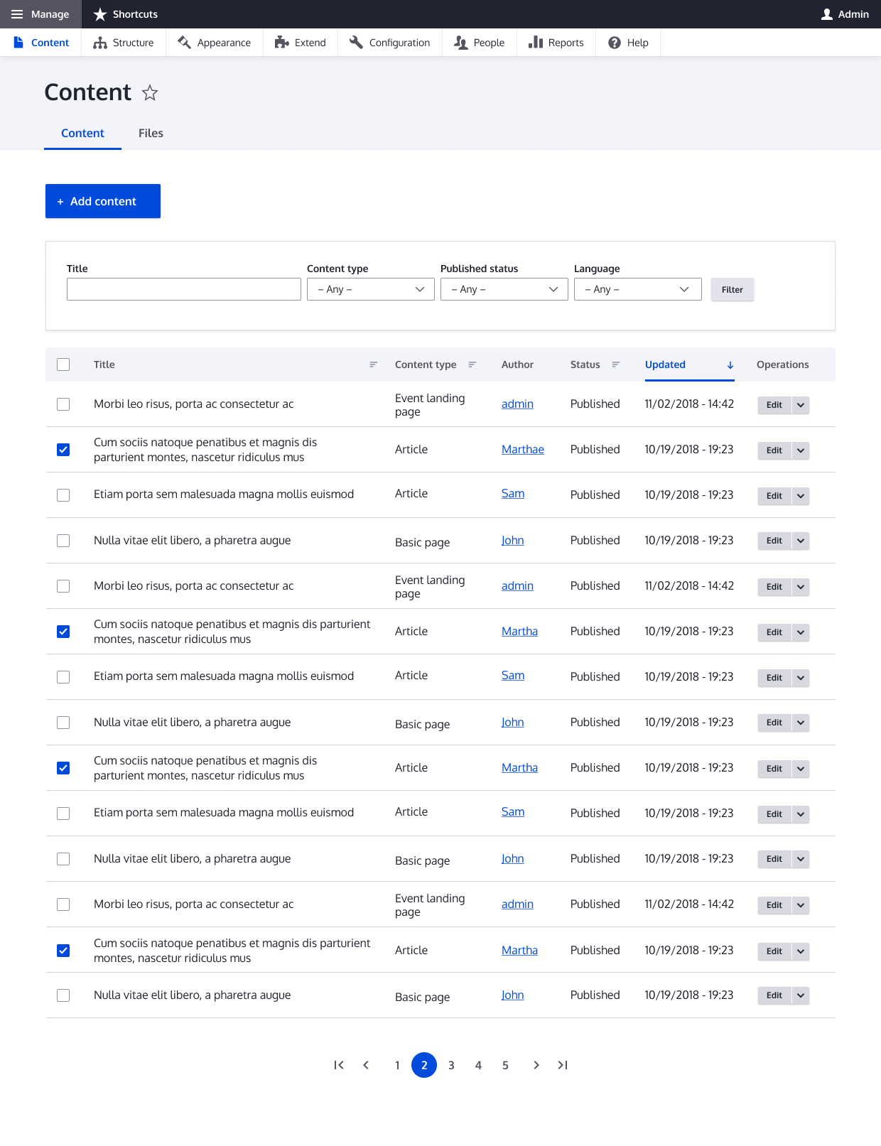
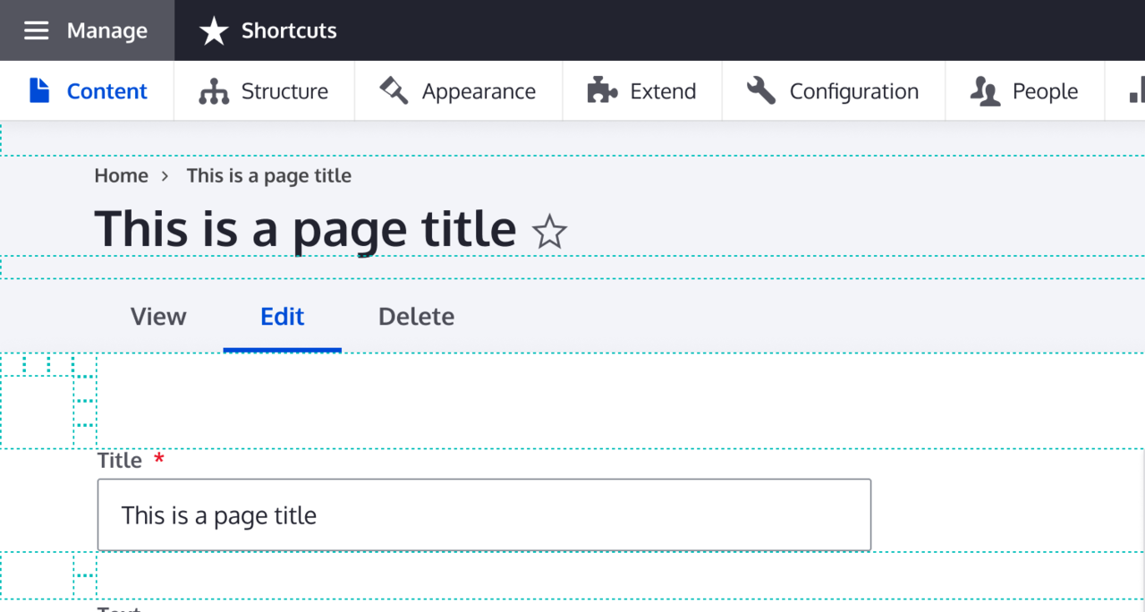
We are introducing a new design system that defines a complete set of principles, patterns, and tools for updating Drupal's administration UI.
In the short term, we plan on updating the existing administration UI with the new design system. Longer term, we are working on creating a completely new JavaScript-based administration UI.

As you can see on Drupal.org, community feedback on the proposal is overwhelmingly positive with comments like Wow! Such an improvement!
and Well done! High contrast and modern look.
.

I also ran the new design system by a few people who spend their days selling Drupal and they described it as "clean" with "good use of space" and a design they would be confident showing to prospective customers.
Whether you are a Drupal end-user, or in the business of selling Drupal, I recommend you check out the new design system and provide your feedback on Drupal.org.
Special thanks to Cristina Chumillas, Sascha Eggenberger, Roy Scholten, Archita Arora, Dennis Cohn, Ricardo Marcelino, Balazs Kantor, Lewis Nyman,and Antonella Severo for all the work on the new design system so far!
We have started implementing the new design system as a contributed theme with the name Claro. We are aiming to release a beta version for testing in the spring of 2019 and to include it in Drupal core as an experimental theme by Drupal 8.8.0 in December 2019. With more help, we might be able to get it done faster.
Throughout the development of the refreshed administration theme, we will run usability studies to ensure that the new theme indeed is an improvement over the current experience, and we can iteratively improve it along the way.
Administration themes must meet large and varied use cases. For example, accessibility is critical for the administration experience, and I'm happy to see that this initiative connected with and have taken feedback into account from the accessibility team.
Acquia has committed to being an early adopter of the theme through the Acquia Lightning distribution, broadening the potential base of projects that can test and provide feedback on the refresh. Hopefully other organizations and projects will do the same.
How can I help?
The team is looking for more designers and frontend developers to get involved. You can attend the weekly meetings on #javascript on Drupal Slack Mondays at 16:30 UTC and on #admin-ui on Drupal Slack Wednesdays at 14:30 UTC.
Thanks to Lauri Eskola, Gábor Hojtsy and Jeff Beeman for their help with this post.
—