Spark update: mobile administration in Drupal
Today, I'd like to share an HTML/JS prototype we've created for a mobile toolbar and dashboard for Drupal that we hope to include as part of the Spark distribution and then propose for Drupal 8 core as part of the Drupal 8 Mobile Initiaitve.
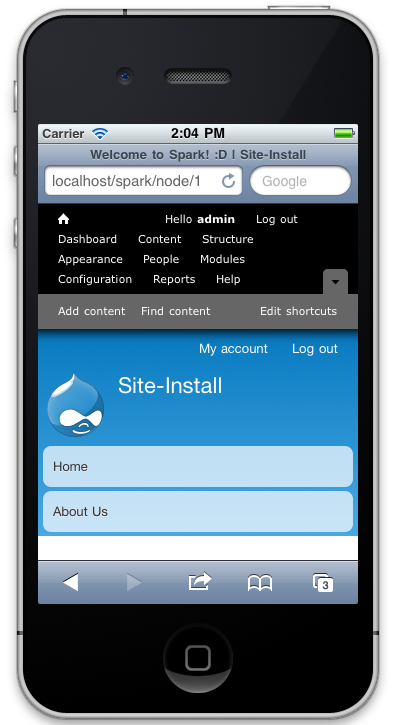
Drupal 7's default administration tools (e.g. Toolbar module and Shortcut module) were not designed in a "mobile first" way, and as such can be difficult to work with on tablets or smartphones. For example, here is a screenshot of what happens to the Toolbar and Shortcut modules when using a responsive version of the Bartik theme on an iPhone:
Kevin O'Leary from the Spark team has come up with the following design. The toolbar design in particular takes heavy inspiration from efforts by Lewis Nyman and his mobile navigation prototype.
We set out to do justice to the complexites of Drupal's administration layer while accounting for the constantly evolving universe of devices. We think what we've come up with is scalable, responsive, and usable.
Here is Preston So, author of the prototype, demonstrating the functionality in a short, 7 minute video:
As we begin work on this feature, it will live at the Mobile friendly navigation toolbar project as a contributed module for Drupal 7 first. If these changes are well-received, I hope we can target this functionality for Drupal 8 core, as a replacement for the Toolbar and Shortcut modules.
Join 5,000+ readers. I'm the creator of Drupal and co-founder of Acquia. I write about Open Source, AI, and the future of the web, with a focus on building, scaling, and thinking long-term.