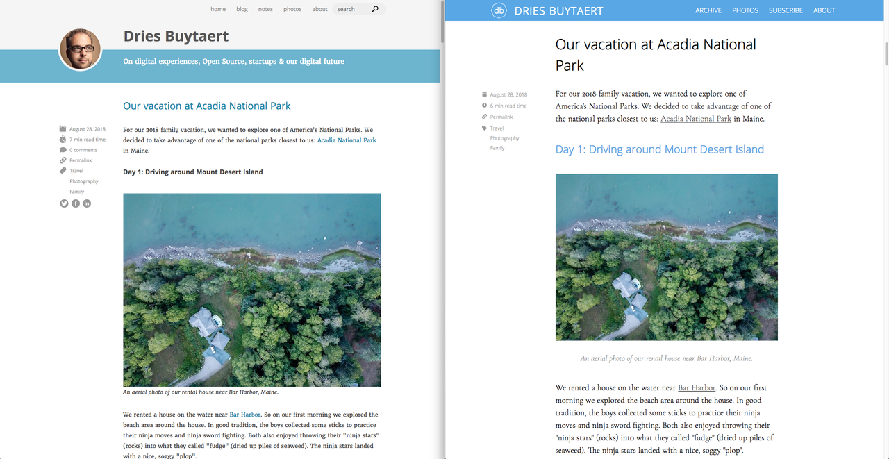
A fresh look for dri.es
In 1999, I decided to start dri.es (formally buytaert.net) as a place to blog, write, and deepen my thinking. While I ran other websites before dri.es, my blog is one of my longest running projects.
Working on my site helps me relax, so it's not unusual for me to spend a few hours now and then making tweaks. This could include updating my photo galleries, working on more POSSE features, fixing broken links, or upgrading to the latest version of Drupal.
The past month, a collection of smaller updates have resulted in a new visual design for my site. If you are reading this post through an RSS aggregator or through my mailing list, consider checking out the new design on dri.es.

The new dri.es may not win design awards, but will hopefully make it easier to consume the content. My design goals were the following:
- Improve the readability of the content
- Improve the discoverability of the content
- Optimize the performance of my site
- Give me more creative freedom
Improve readability of the content
To improve the readability of the content, I implemented various usability best practices for spacing text and images.
I also adjusted the width of the main content area. For optimal readability, you should have between 45 and 75 characters on each line. No more, no less. The old design had about 95 characters on each line, while the new design is closer to 70.
Both the line width and the spacing changes should improve the readability.
Improve the discoverability of content
I also wanted to improve the discoverability of my content. I cover a lot of different topics on my blog — from Drupal to Open Source, startups, business, investing, travel, photography and the Open Web. To help visitors understand what my site is about, I created a new navigation. The new Topics-page shows visitors a list of the main topics I write about. It's a small change, but it should help new visitors figure out what my site is about.
Optimize the performance of my site
Less noticeable is that the underlying HTML and CSS code is now entirely different. I'm still using Drupal, of course, but I decided to rewrite my Drupal theme from scratch.
The new design's CSS code is more than three times smaller: the previous design had almost 52K of theme-specific CSS while the new design has only 16K of theme-specific CSS.
The new design also results in fewer HTTP requests as I replaced all stand-alone icons with inline SVGs. Serving the page you are reading right now only takes 16 HTTP requests compared to 33 HTTP requests with the previous design.
All this results in faster site performance. This is especially important for people visiting my site from a mobile device, and even more important for people visiting my site from areas in the world with slow internet. A lighter theme with fewer HTTP requests makes my site more accessible. It is something I plan to work more on in the future.
Website bloat is a growing problem and impacts the user experience. I wanted to lead by example, and made my site simpler and faster to load.
The new design also uses Flexbox and CSS Grid Layout — both are more modern CSS standards. The new design is fully supported in all main browsers: Chrome, Firefox, Safari and Edge. It is, however, not fully supported on Internet Explorer, which accounts for 3% of all my visitors. Internet Explorer users should still be able to read all content though.
Give me more creative freedom
Last but not least, the new design provides me with a better foundation to build upon in subsequent updates. I wanted more flexibility for how to lay out images in my blog posts, highlight important snippets, and add a table of content on long posts. You can see all three in action in this post, assuming you're looking at this blog post on a larger screen.
— Dries Buytaert