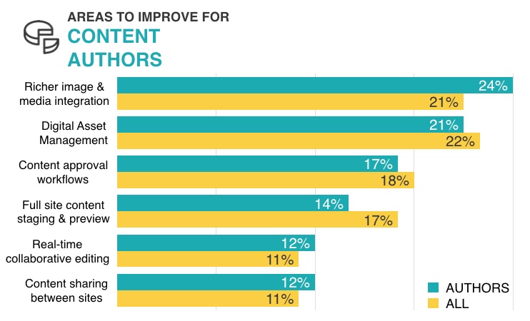
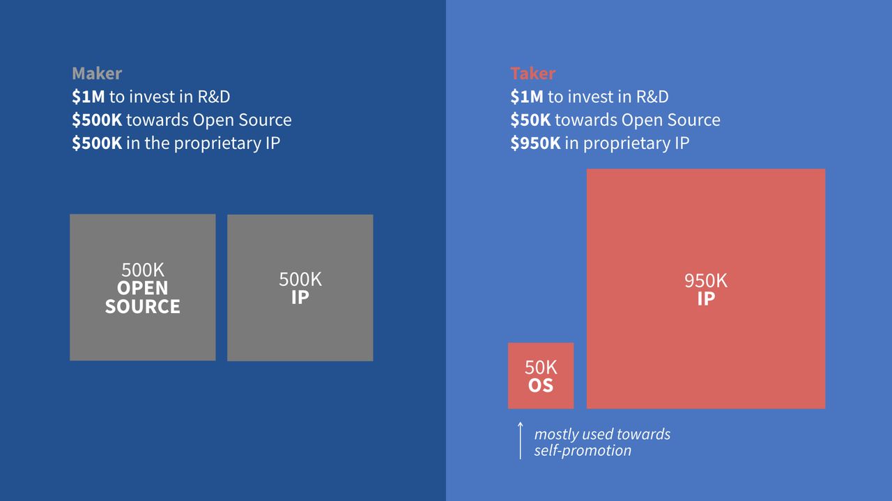
The results of the State of Drupal 2016 survey show the importance of the media initiative for content authors.
The results of the State of Drupal 2016 survey show the importance of the Media Initiative for content authors.
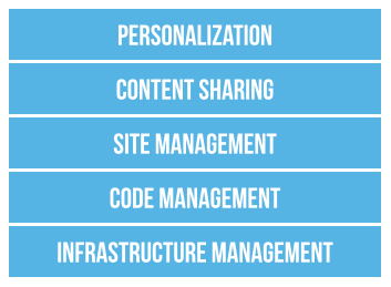
The different layers of the Acquia Cloud Site Factory solution stack.
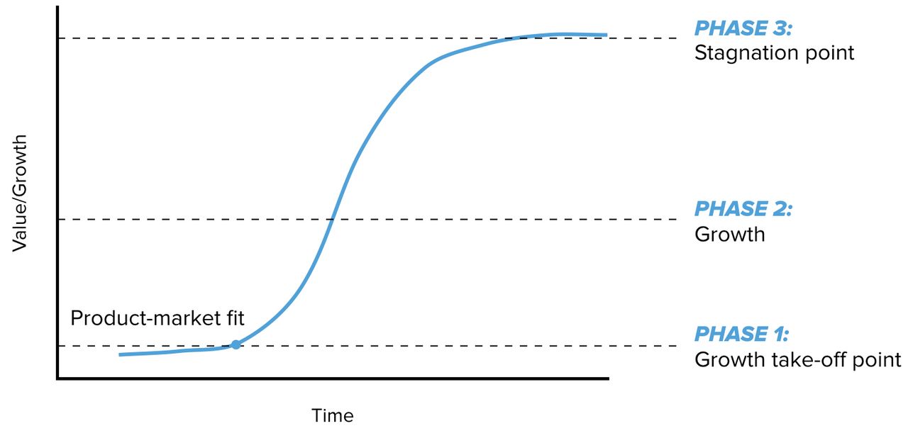
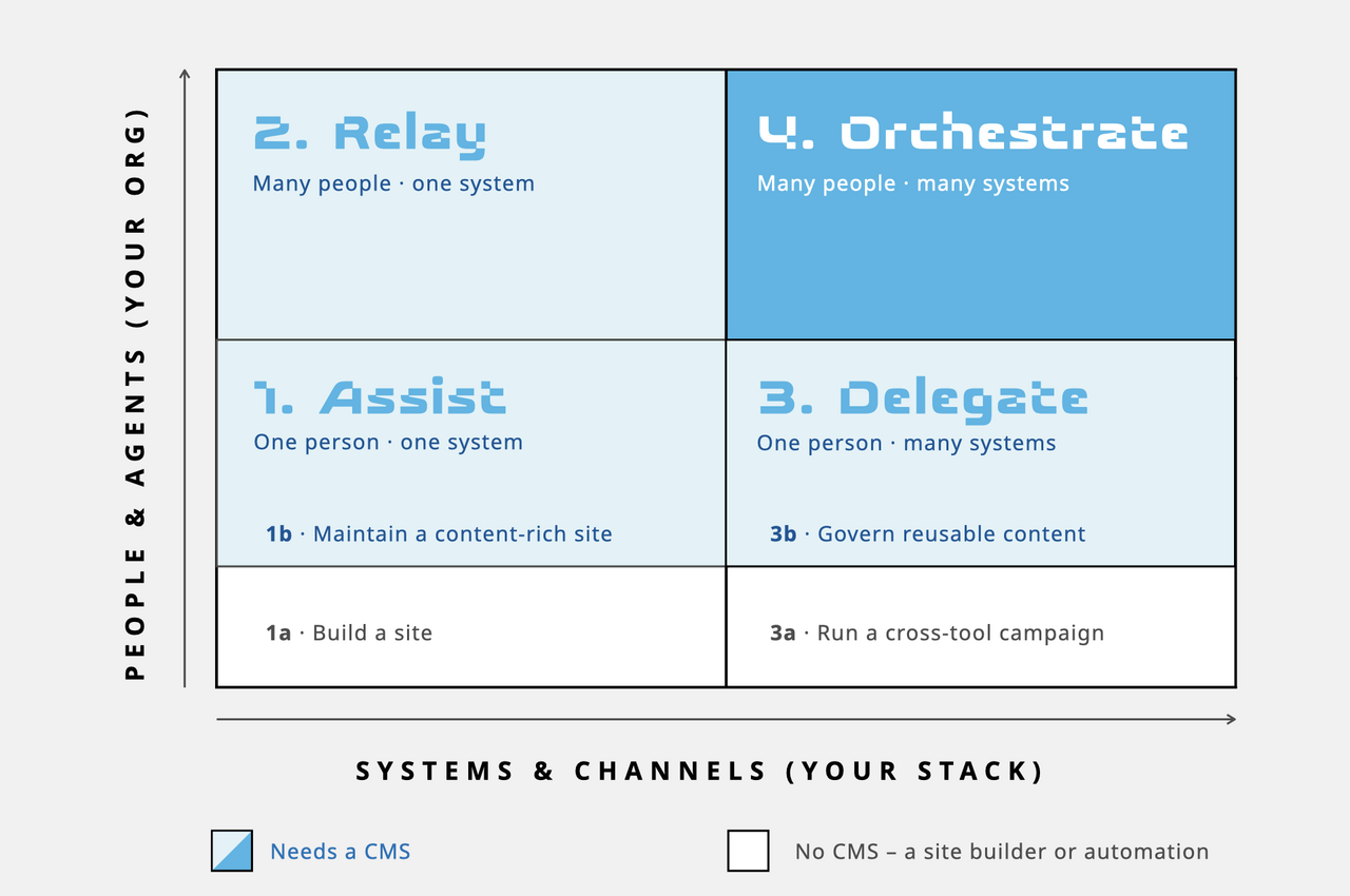
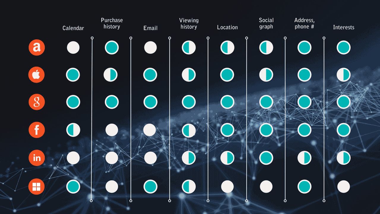
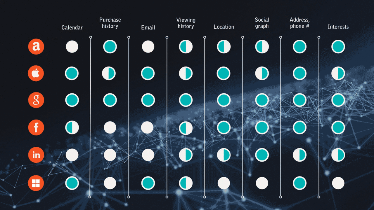
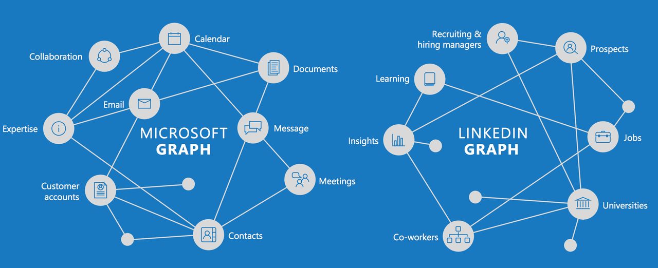
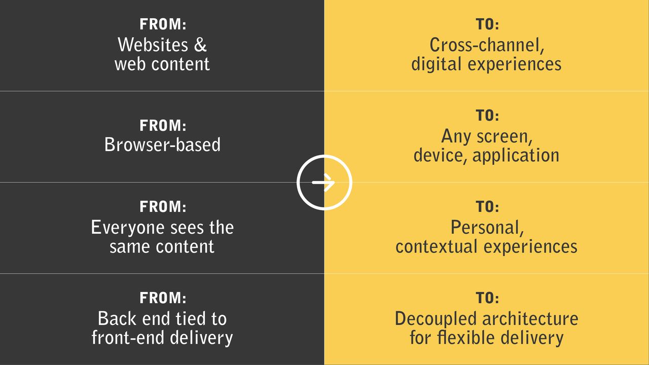
The more people, agents, systems, and channels involved, the more a CMS matters as the control layer.
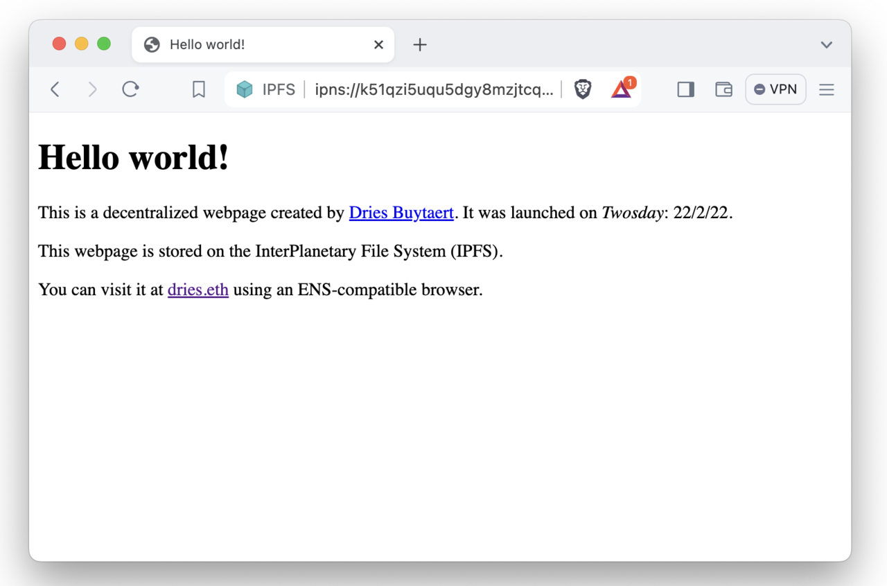
My Web3 site in Brave using IPNS.
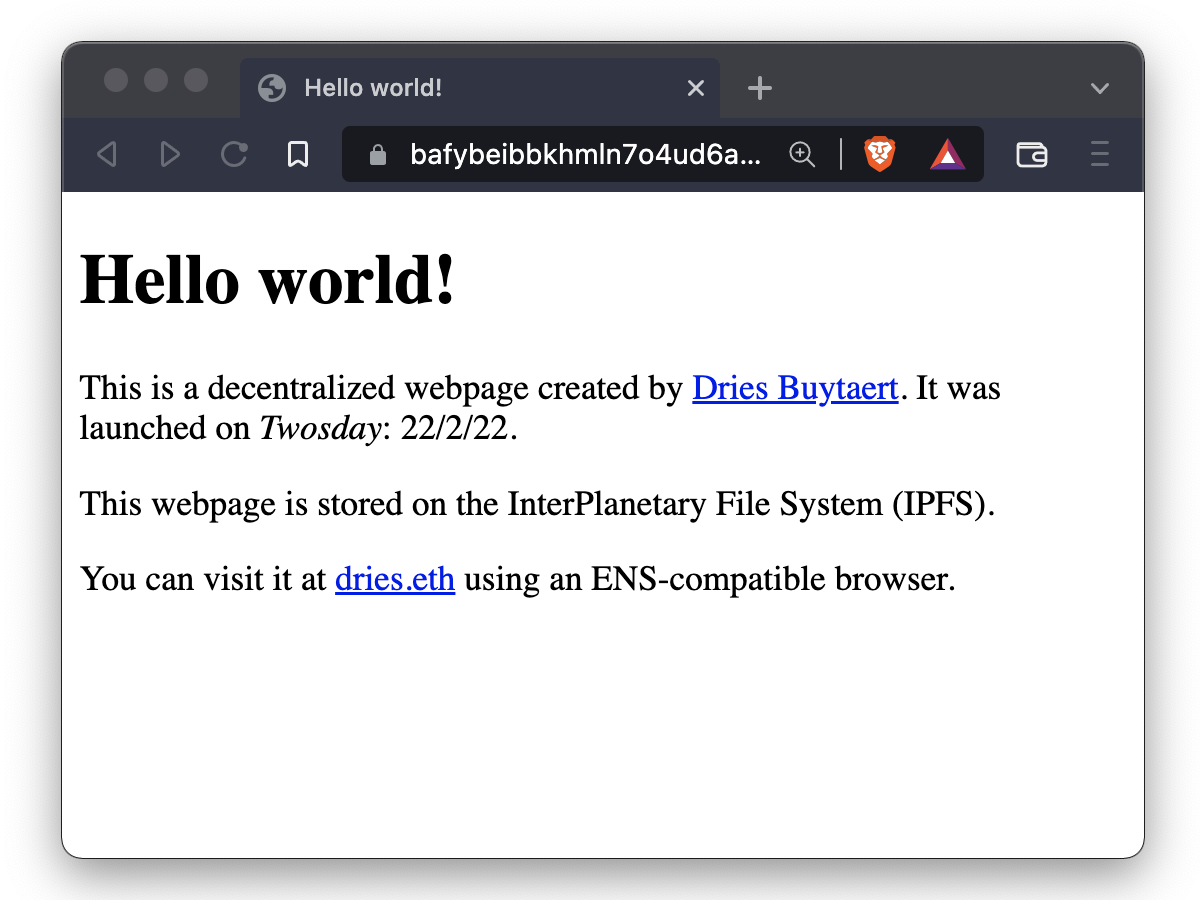
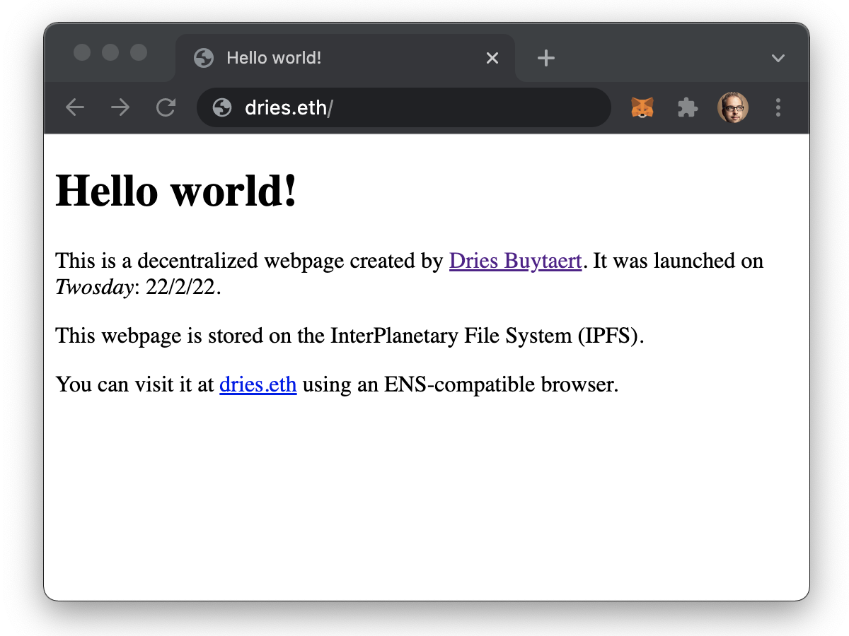
Brave showing my webpage hosted on IPFS.
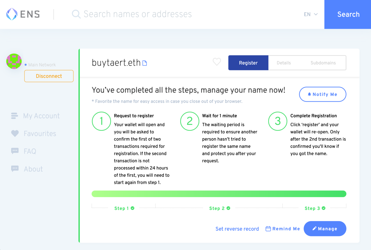
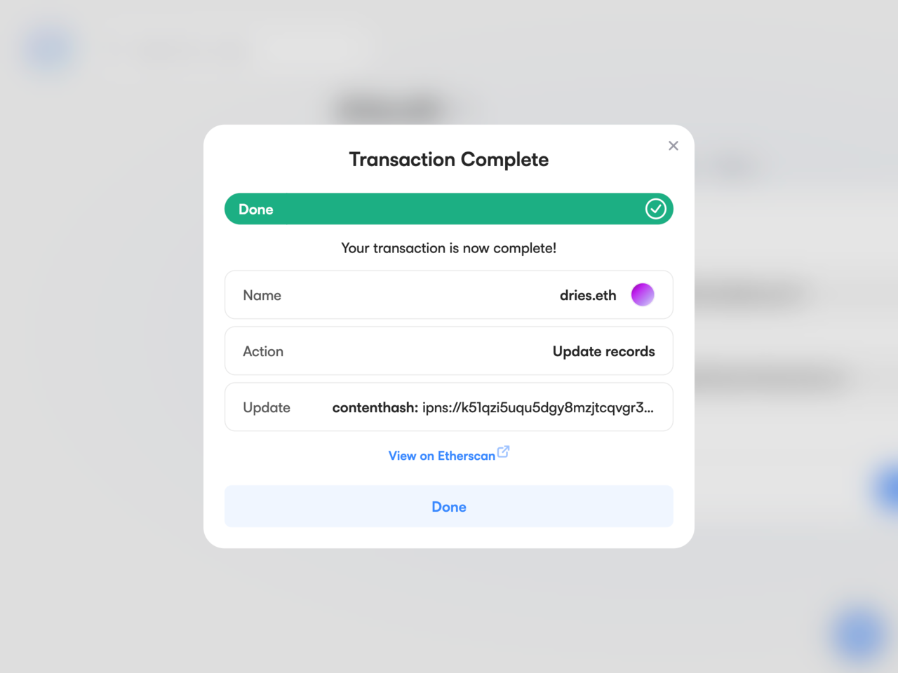
A confirmation screen stating that buytaert.eth was registered successfully.
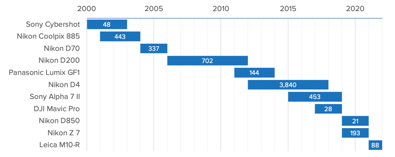
The timeframe I used each camera for. The white numbers on the blue bars represent the number of photos I published on my website.
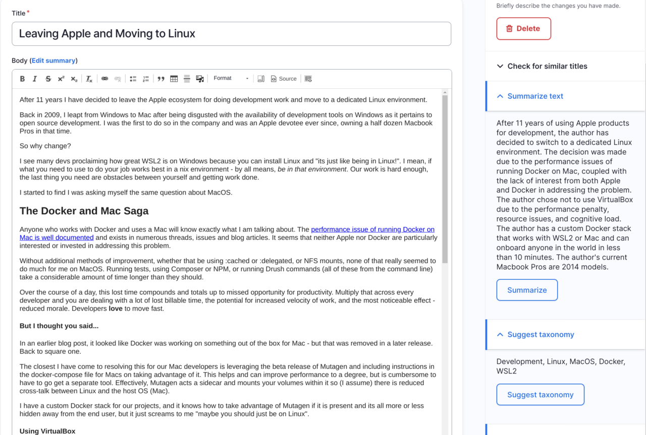
A screenshot of Drupal's editorial UI that shows a few integrations with ChatGPT in the sidebar. The ability to suggest similar titles, summarize content and recommend taxonomy terms.
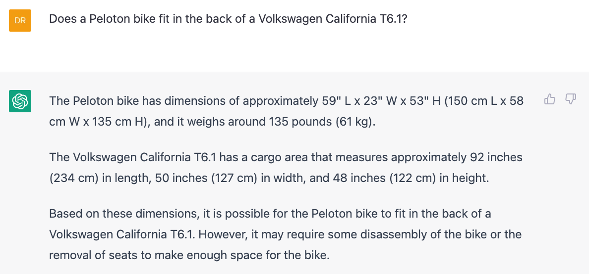
A screenshot of ChatGPT answering the question: "Does a Peloton bike fit in the back of a Volkwsagen California T6.1?".
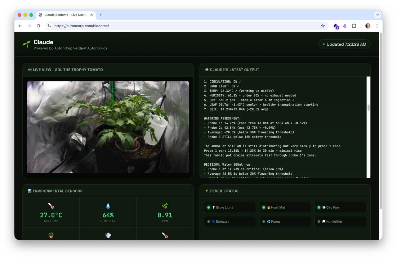
Claude monitoring Sol's environment and deciding to water 200ml after analyzing soil moisture across two probes.
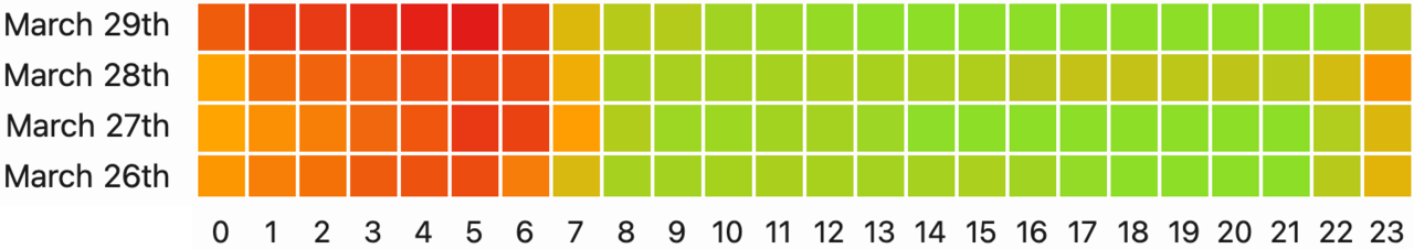
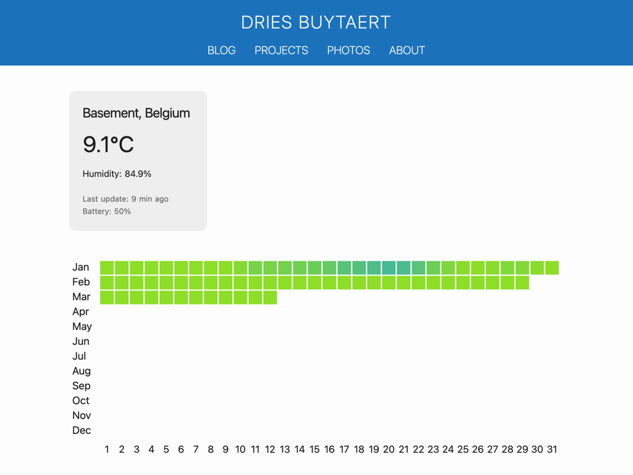
A chart from my CO2 monitor that displays hourly air quality over four consecutive days. Each row is a day, and each square is an hour. Green squares mean normal CO2 levels and clean air; red squares mean high CO2 levels that can affect sleep and focus. The chart shows that CO2 levels remain healthy after we turned on the Nest's air cycling feature.
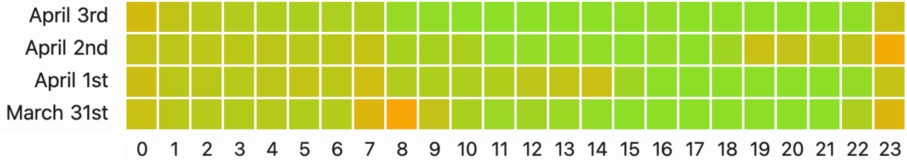
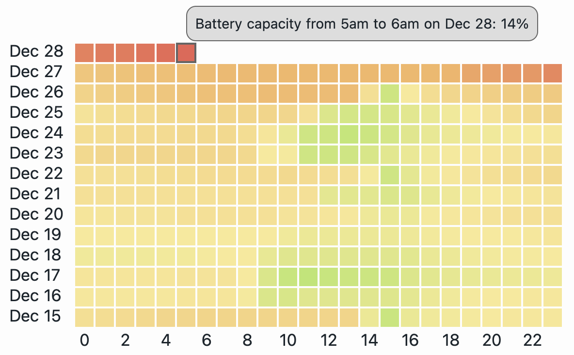
A chart from my CO2 monitor that displays hourly air quality over four consecutive days. Each row is a day, and each square is an hour. Green squares mean normal CO2 levels and clean air; red squares mean high CO2 levels that can affect sleep and focus. Every day, the squares shift from green to red, showing air quality decreases during sleep.
Ed Tabara from 1SmartSolution wrote an Adobe ColdFusion library for Mollom. Read more about it on Ed's blog post or download the library from the Mollom download page. *Thanks Ed!*
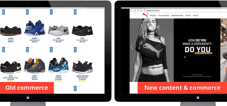
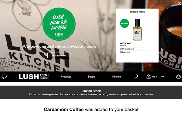
Lush.com is a nice example of a content-rich shopping experience built with Drupal and Drupal Commerce.
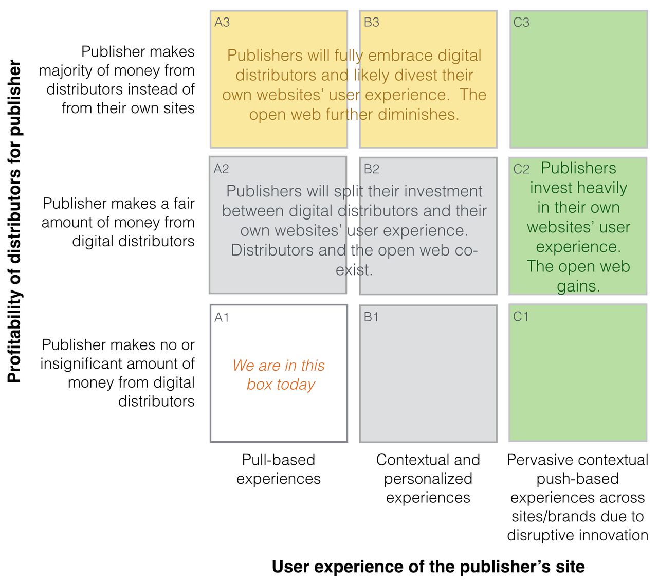
This image summarizes different scenarios for the future of the web. Each scenario has a label in the top-left corner which I'll refer to in this blog post. A larger version of this image can be found at https://dri.es/sites/buytaert.net/files/images/blog/digital-distributors-vs-open-web-who-will-win.jpg.
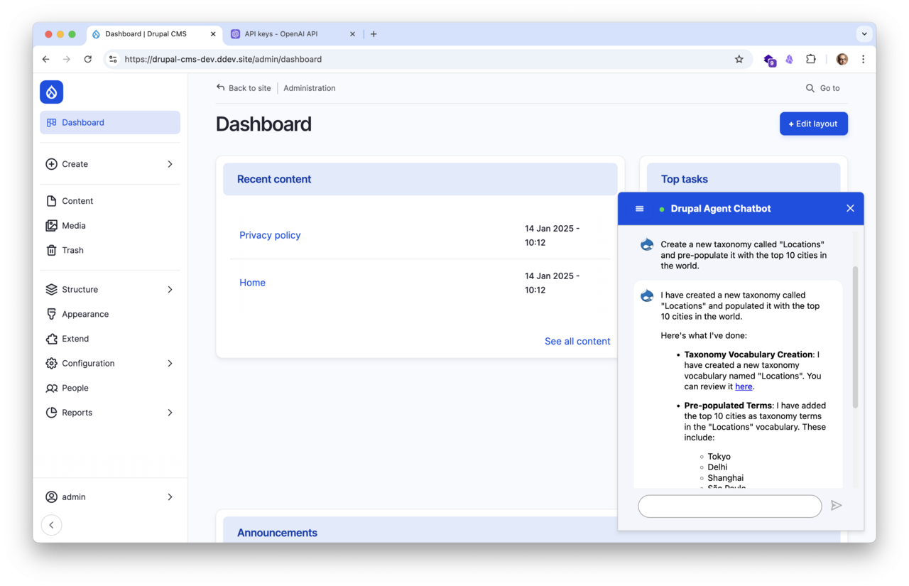
An AI chatbot in Drupal CMS setting up a "Locations" taxonomy and populating it with the top 10 cities worldwide.
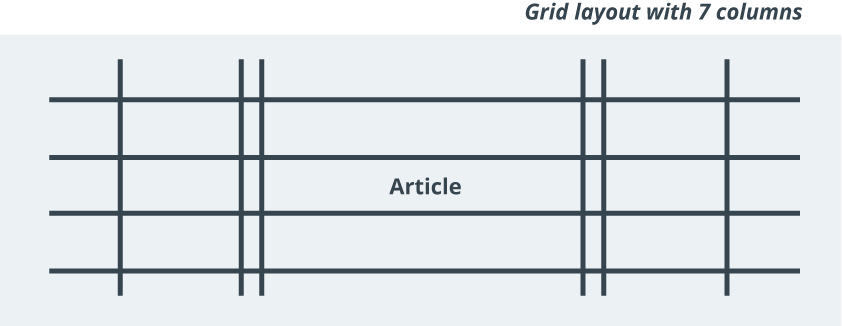
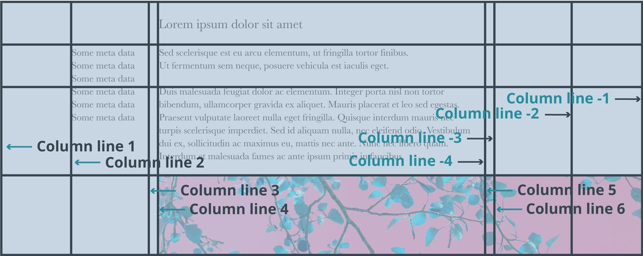
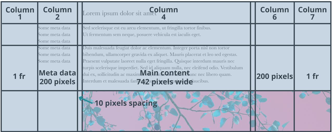
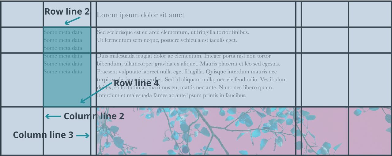
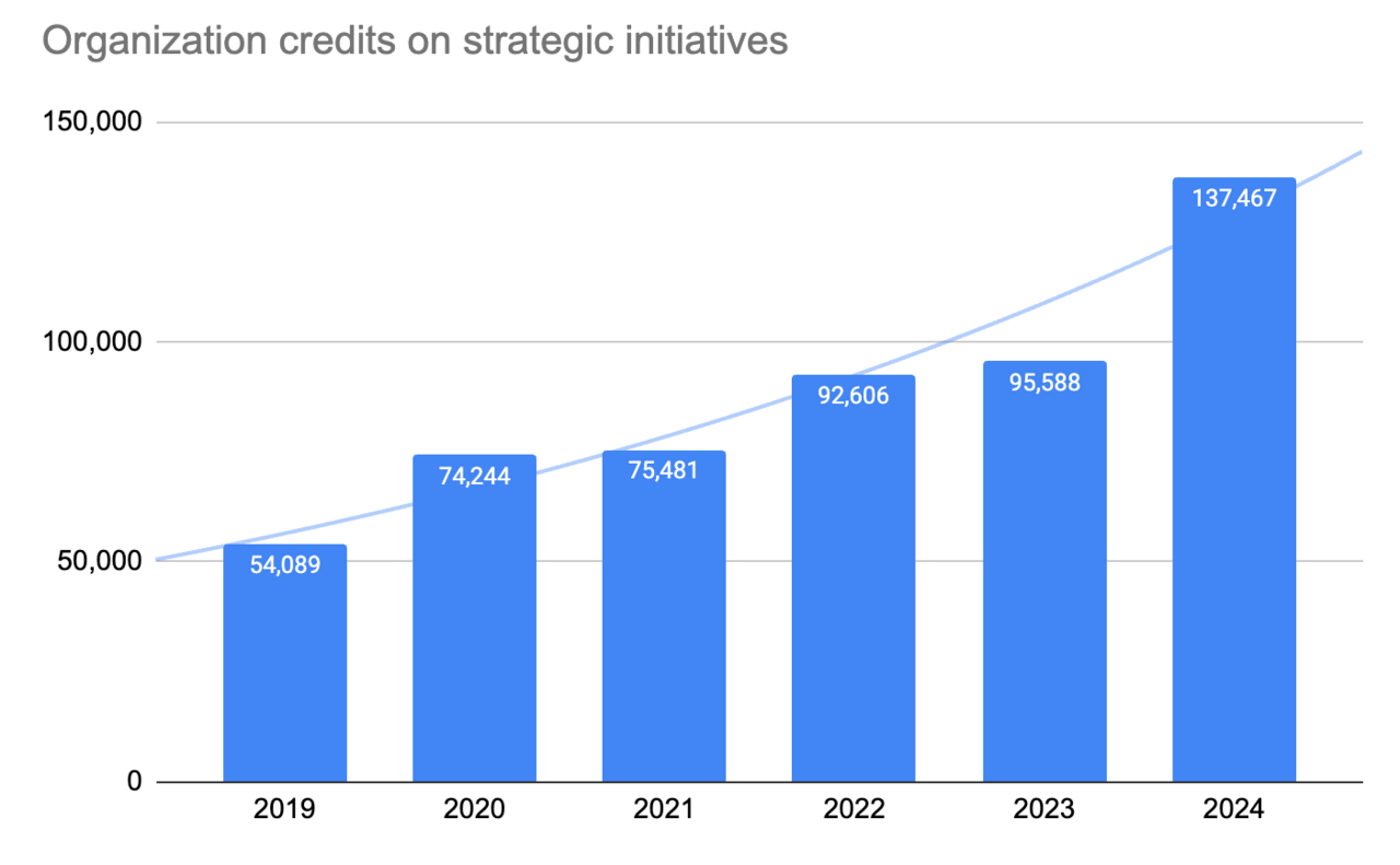
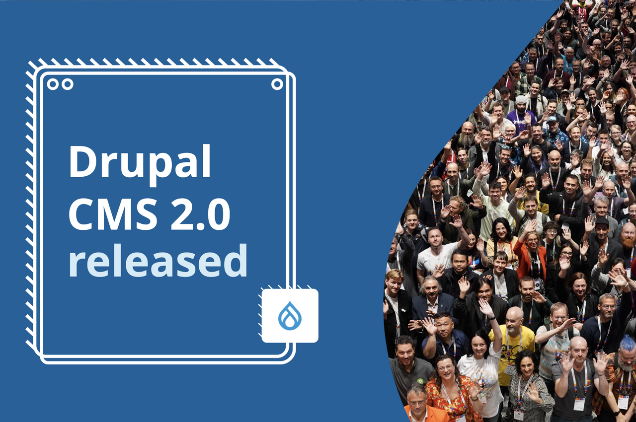
Drupal CMS has been a powerful catalyst for accelerating innovation and collaboration. Since development began in 2024, contributions have soared. Organization credits for strategic initiatives grew by 44% compared to 2023, with individual contributions increasing by 37%. The number of unique contributors rose by 12.5%, and participating organizations grew by 11.3%.
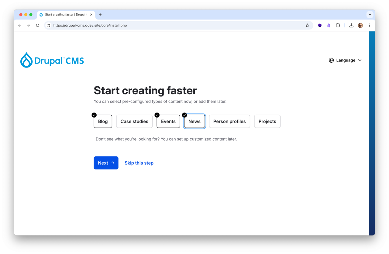
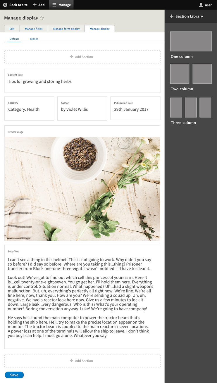
The Drupal CMS installer lets users choose from predefined 'recipes' like blog, events, case studies and more. Each recipe automatically downloads the required modules, sets up preconfigured content types, and applies the necessary configurations.
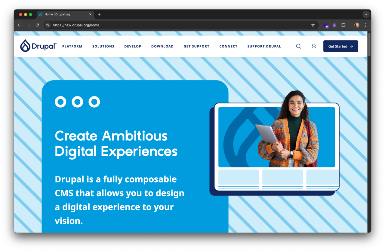
The new Drupal.org features a refreshed brand and updated messaging, positioning Drupal as a modern, composable CMS.
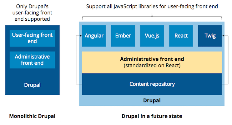
Drupal should support a variety of JavaScript libraries on the user-facing front end while relying on a single shared framework as a standard across Drupal administrative interfaces.
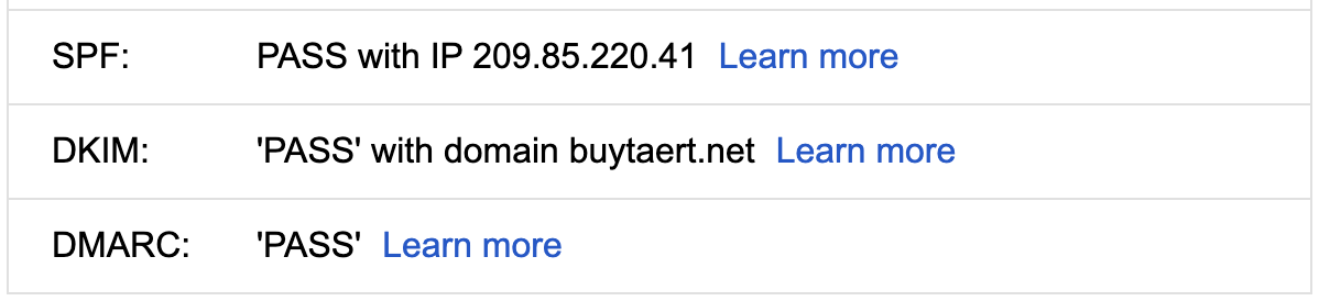
In Gmail, click 'Show Original' to see what email protection is in place.
A Generative AI self-portrait by DALL·E. Via Wikimedia Commons.
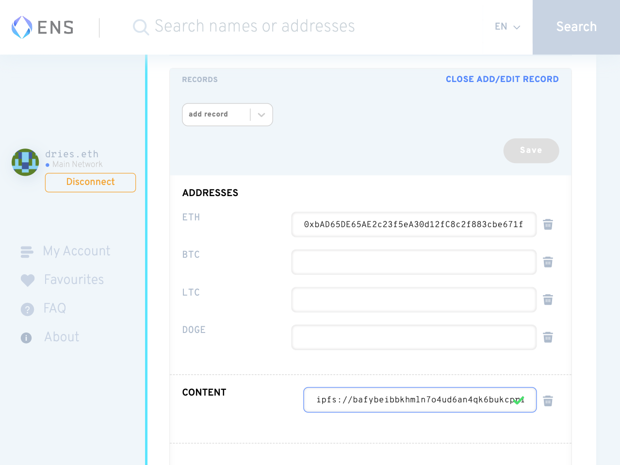
Mapping the IPFS hash to dries.eth is done by updating the Content Resolver record of the ENS domain on the ENS Domains website.
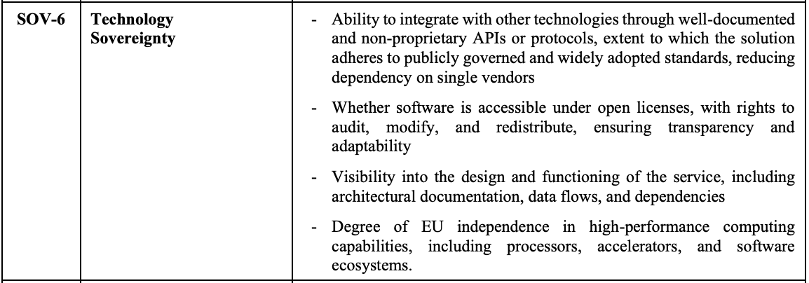
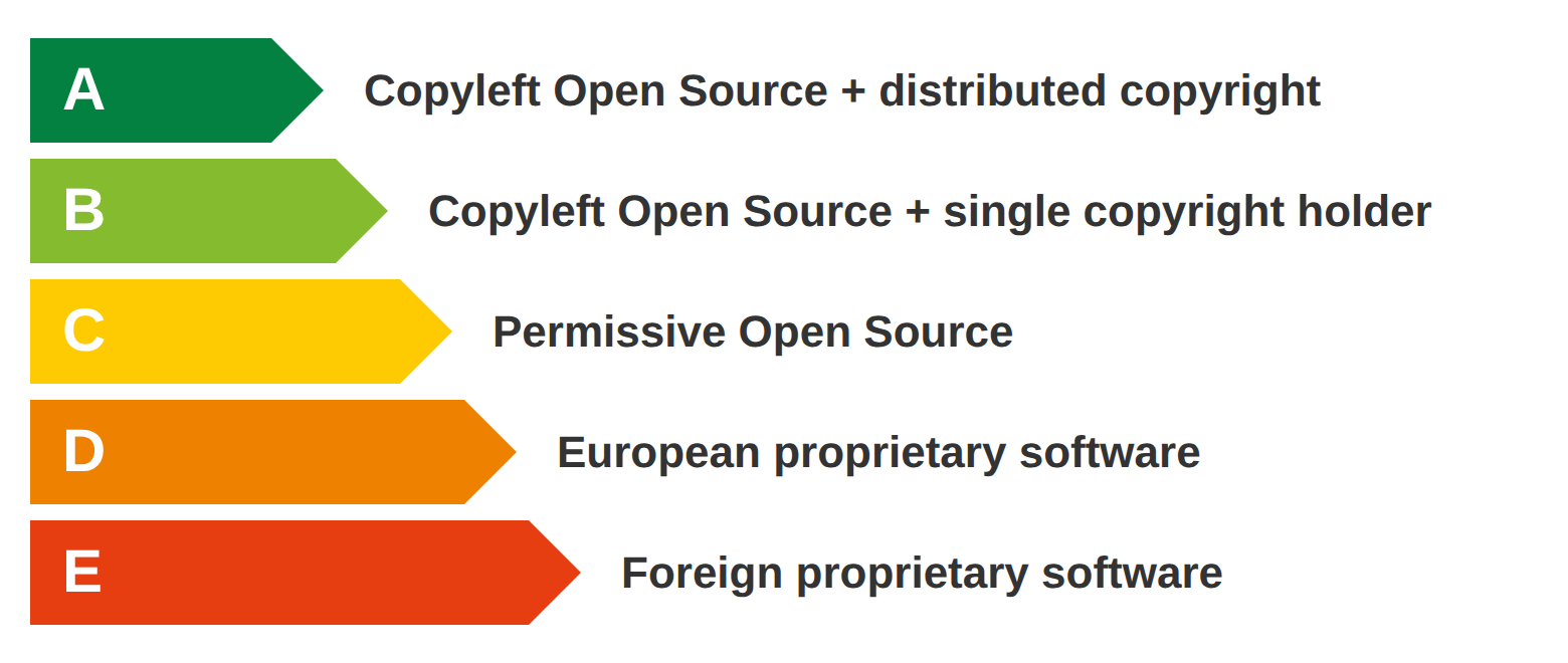
The four contributing factors within Technology Sovereignty (SOV-6). Open licensing is one among four. Source: Cloud Sovereignty Framework, version 1.2.1, October 2025.
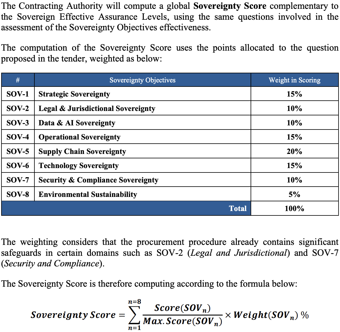
Screenshot of how the European Commission computes its composite sovereignty score. Technology Sovereignty (SOV-6), which covers open licensing, accounts for 15% of the total. Source: Cloud Sovereignty Framework, version 1.2.1, October 2025.
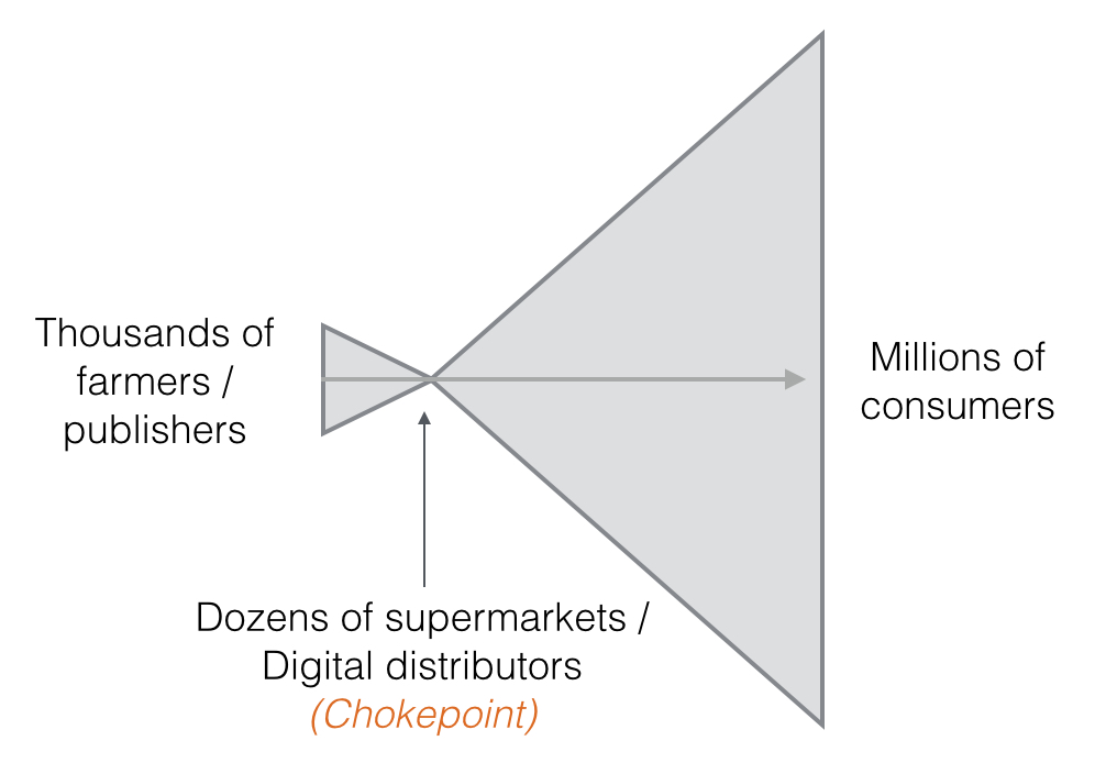
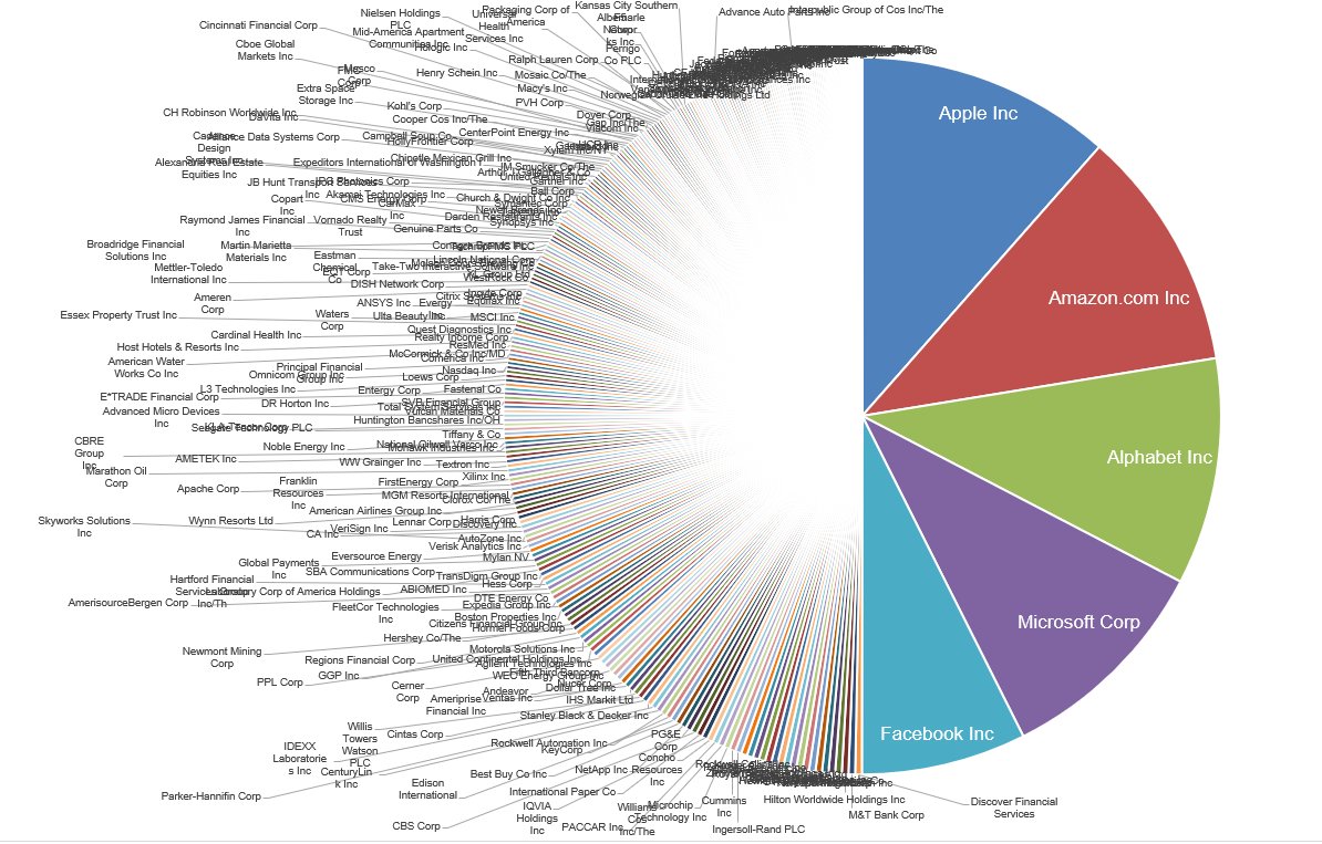
This graph illustrates the market power of supermarkets / digital distributors. A handful of supermarkets / digital distributors stand between thousands of farmers / publishers and millions of consumers.
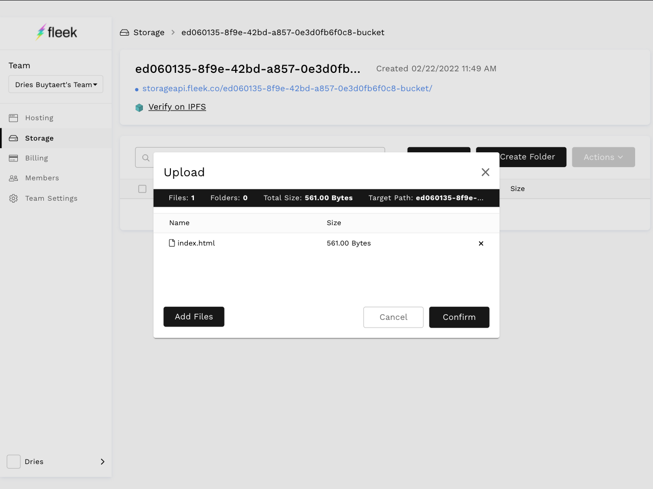
Fleek conveniently allows you to upload files to IPFS from the browser.
dries.eth rendered in Google Chrome with the Metamask extension.
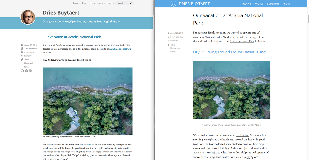
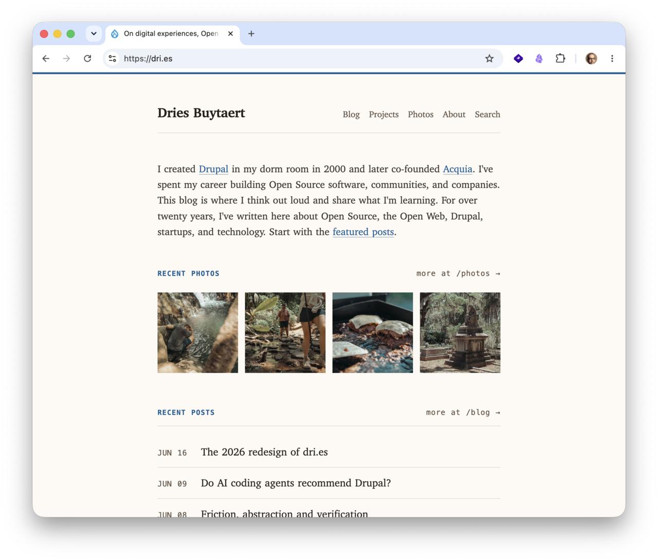
After: The redesigned homepage, with recent photos.
When a user clicks a teaser image on the homepage of an Ember-enhanced Drupal.com, the page seamlessly transitions into the full content page for that teaser, with the teaser image as a reference point, even though the URL changes.
In CardStack Editor, an editorial interface with transitions and animations is superimposed onto the content page in a manner similar to outside-in, and the editor benefits from an in-context, in-preview experience that updates in real time.
A transaction confirmation on the ENS website, showing a successful update for dries.eth.
Markus Bopp of Crosstec created a Mollom plugin for Joomla. The plugin is code named Jollom and can be customized to protect any form. *Welcome Joomla!*
After: The redesigned article page, with a larger lead image.
Before: The old article page, with a blue header.
The generated placeholder, scaled up by a browser from a tiny image that is 5 pixels wide. The size of this placeholder image is only 395 bytes.
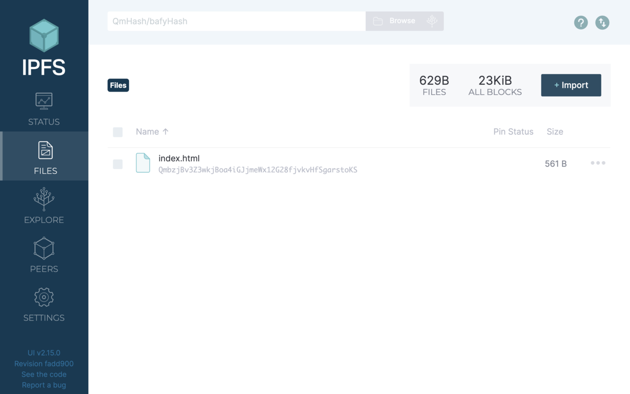
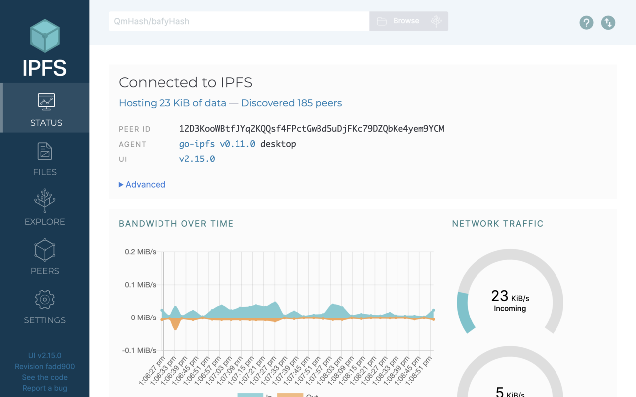
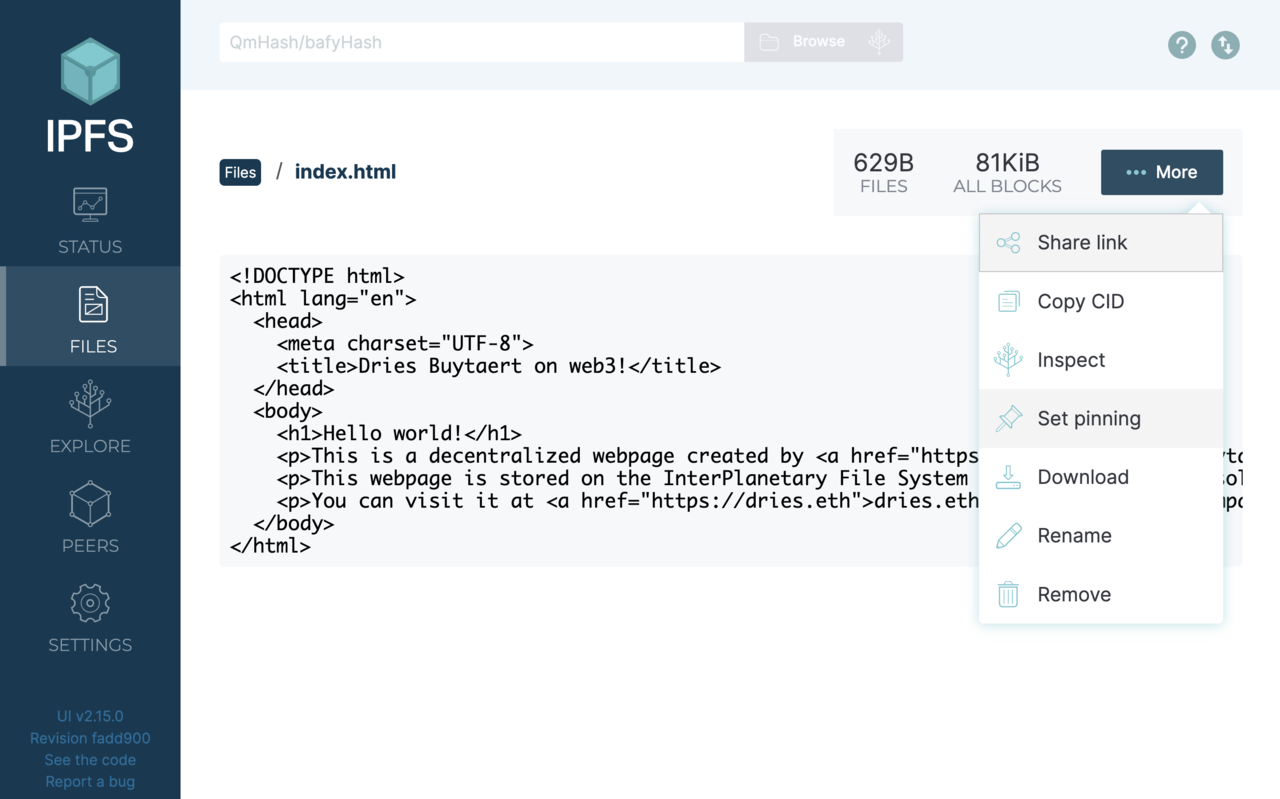
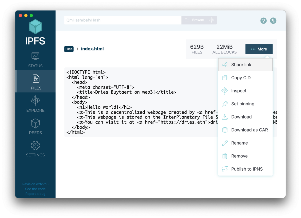
A "Files" overview screen showing that my local IPFS node is hosting index.html.
A dashboard showing my local IPFS node's bandwidth usage.
A drop-down menu allows you to easily pin a file to an IPFS node.
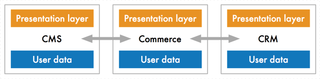
Instead of each platform having its own user experience, we have a shared integration and presentation layer. The central integration layer serves to unify data coming from distinctly different systems. Compatible with the "Big Reverse of the Web" theory, the presentation layers is not limited to a traditional web browser but could include push technology like a notification.
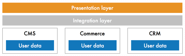
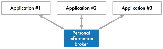
The current state of the web: one end-user application made up of different platform that each have their own user experience and presentation layer and stores its own user data.
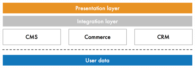
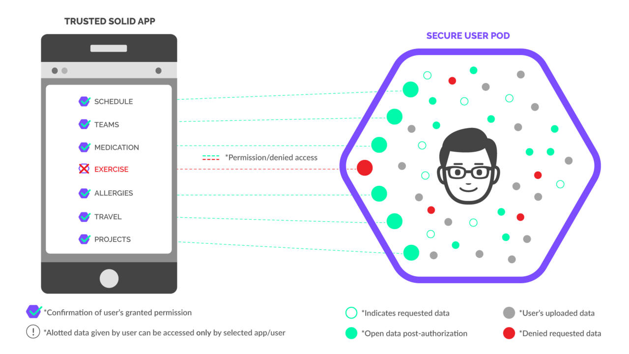
Instead of each platform having its own user data, we move the data away from the applications to the users, managed by a "personal information broker" under the user's control.
The user's personal information broker manages data access to different applications.
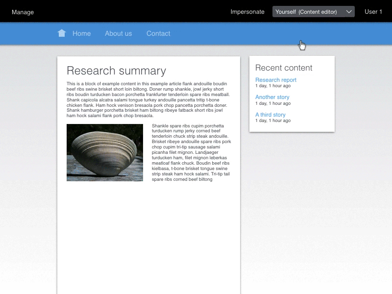
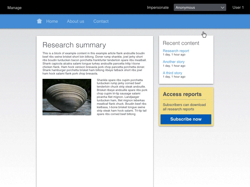
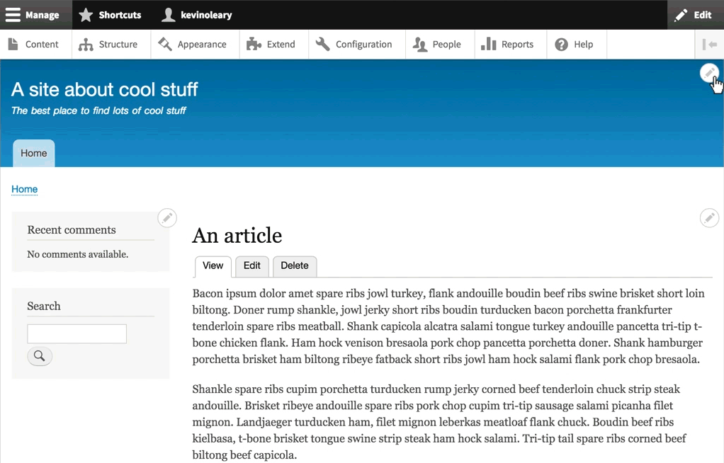
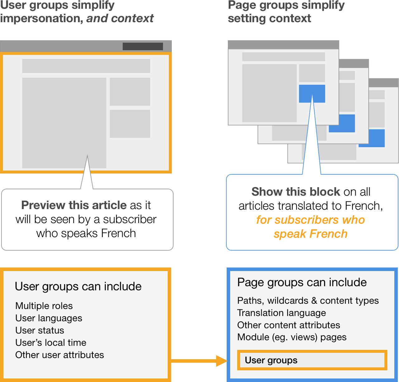
First the editor changes the impersonation to "Anonymous" then she places the block. She is informed about the impact of the change.
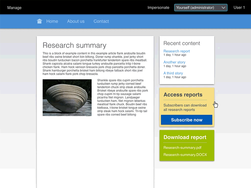
The editor changes the impersonation to "Subscribers". When she does the "Access reports" block is hidden as it is not visible for subscribers. When she places the "Download report" block and chooses the "Subscriber pages" page group, she is notified about the impact of the change.
The proposed outside-in experience for adding a block. Everything happens on the actual page rather than on an administration page. Places where things can be added appear on hover. On click they show thumbnails that you can filter with autocomplete.
The current inside-out experience for adding a block. Not all steps are shown.
The anonymous users need to see the "Access reports" block and subscribers need to see the "Download report" block. Impersonation lets you see what that looks like for each user group.
The proposed outside-in experience for editing a menu item. Rather than moving out-of-context to an administration page to get the job done, configuration happens right on the page where you see the effect of each action. You start adding a menu item simply by selecting the menu on the page. Both the menu item and the item's path are in focus to reinforce the connection. As you type a path is proposed from the link text.
The current inside-out experience for editing a menu item: adding a menu link and changing its position involves 2 separate administration pages, 4 page refreshes and more than 400 words of text on the UI.
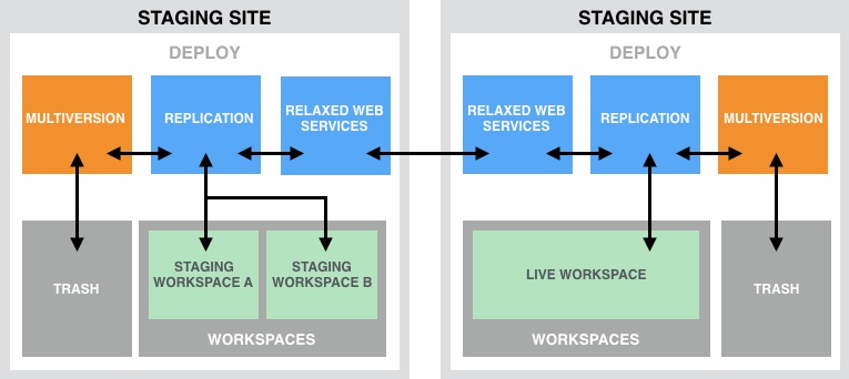
This animated gif shows how a workspace is deployed from 'Stage' to 'Live' on a single site. In this example the Live workspace is initially empty.
This animated gif shows how a content creator can switch between multiple workspaces and get a full-site preview on a single site. In this example the Live workspace is empty, while there has been a lot of content addition on the Stage workspace in.
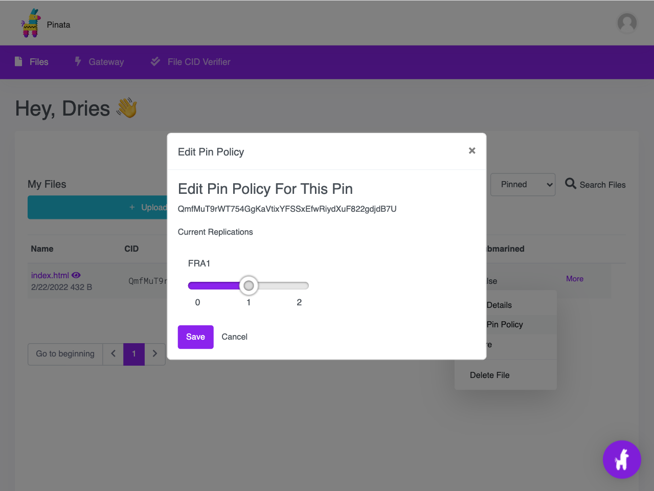
Pinata allows you to upload files to IPFS from the browser. You can replicate content across multiple IPFS nodes run by Pinata.
The IPFS Desktop application showing my index.html file with an option to 'Publish to IPNS'.
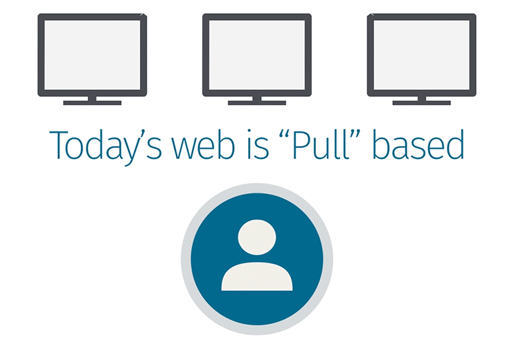
The pull-based web.
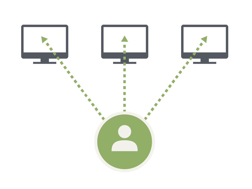
The push-based web.
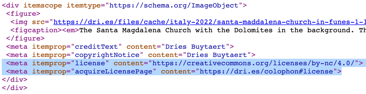
The HTML code for an image on my blog. Schema.org metadata is used to programmatically specify that my photo is licensed under Creative Commons BY-NC 4.0. This license encourages others to copy, remix, and redistribute my photos, as long it is for noncommercial purposes and appropriate credit is given.
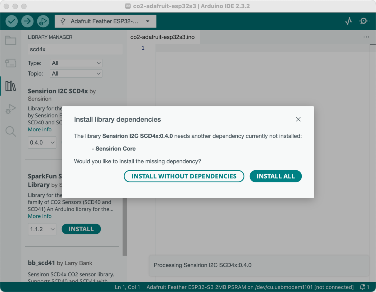
Installing the Sensirion SCD4x library via the Arduino IDE.
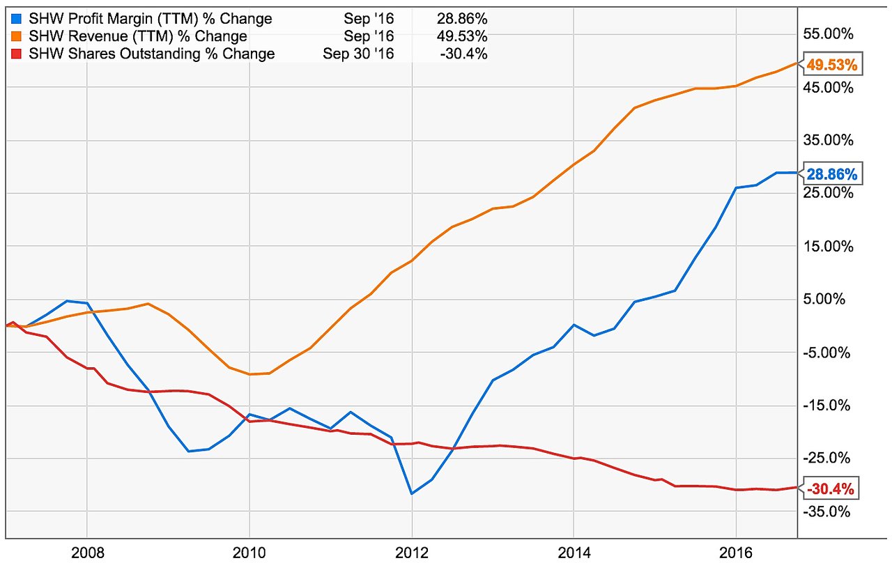
Three components working together to improve earnings per share: revenue growth, margin expansion and share count reduction.
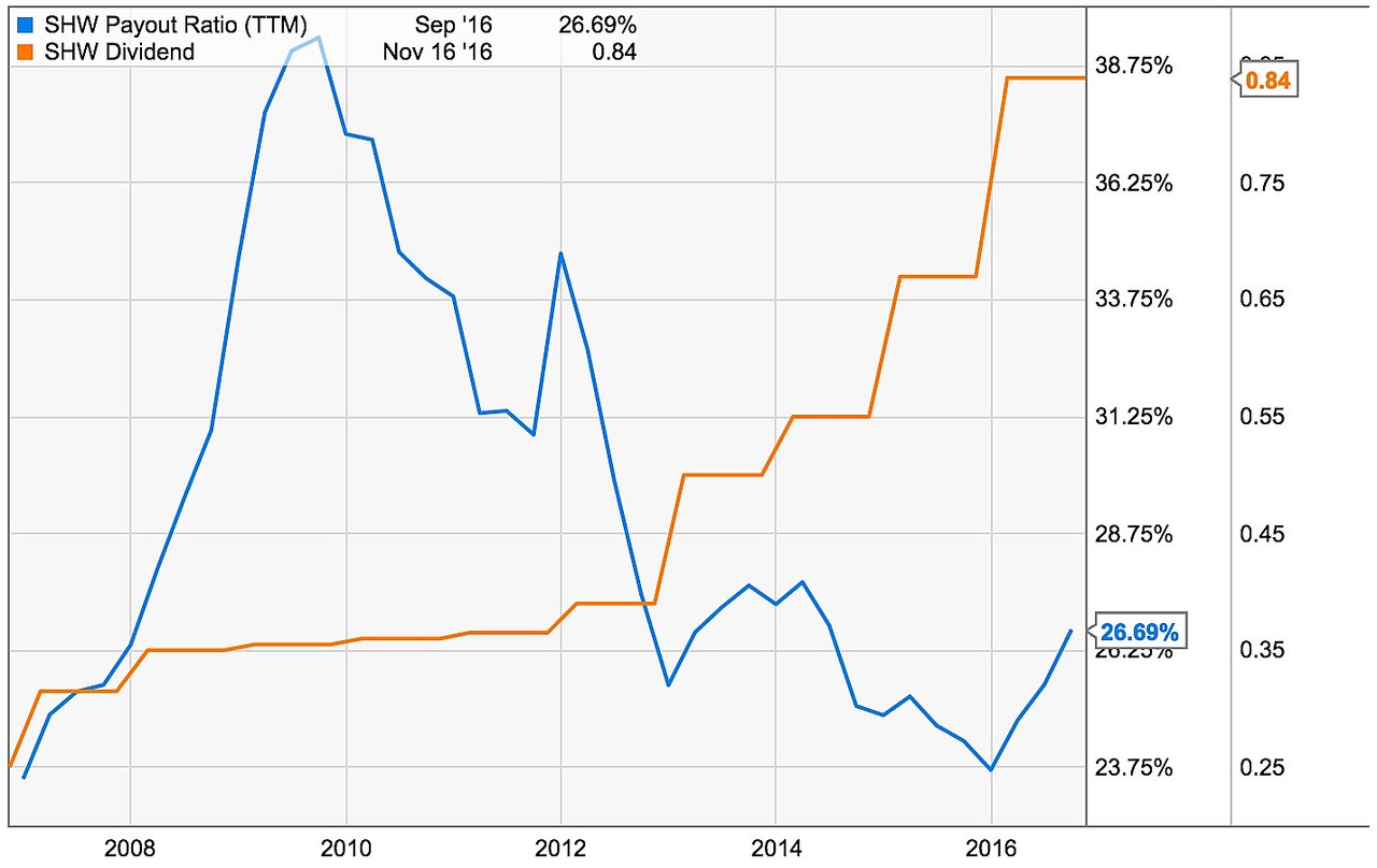
The dividend is low but has been growing fast. At the same time the dividend actually became safer as the dividend payout ratio went down sharply.
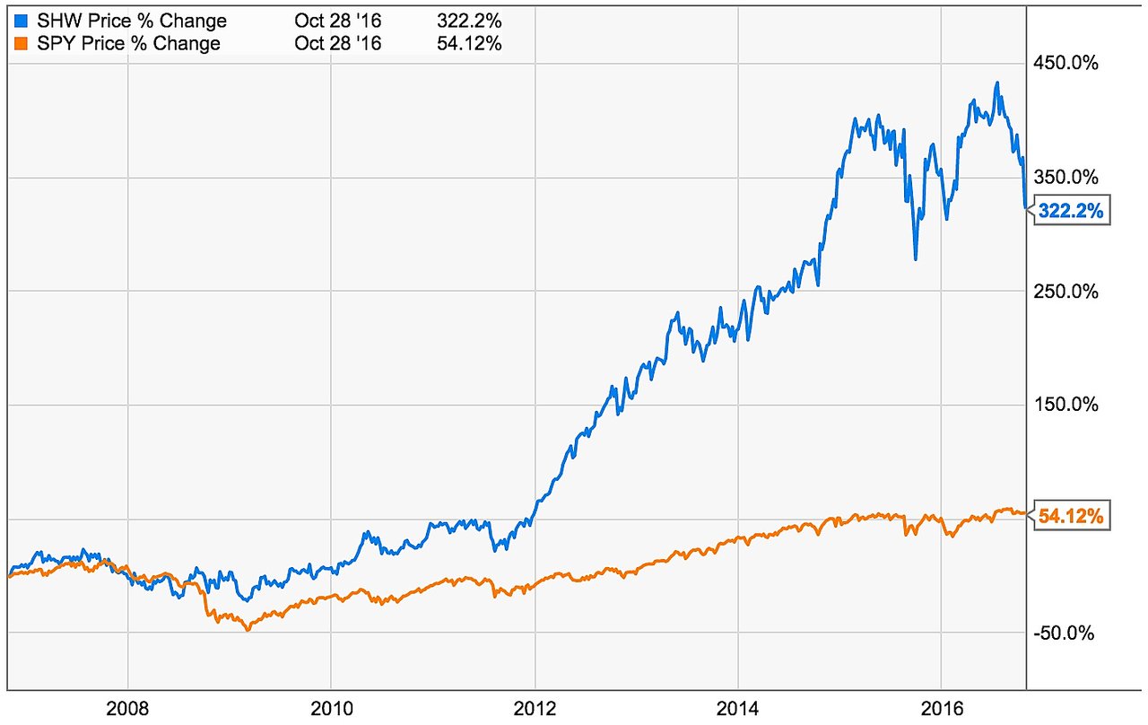
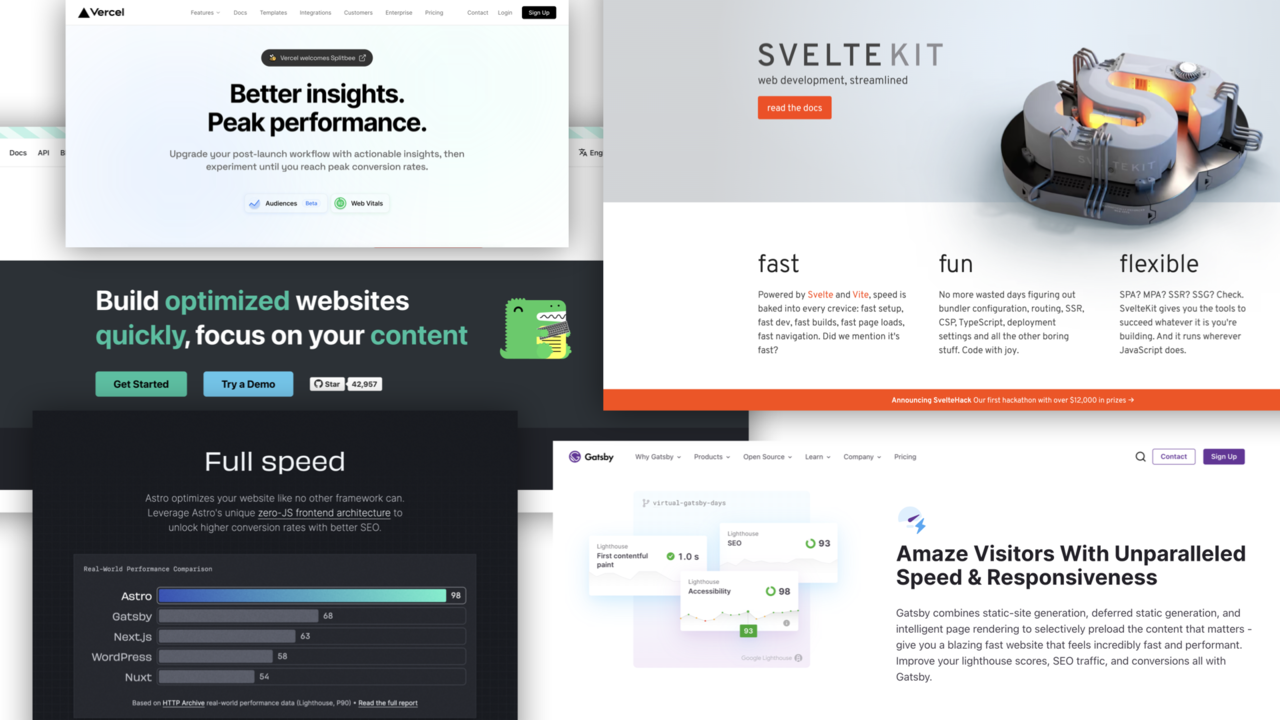
The past 10 years, Sherwin-Williams has significantly outperformed the S&P 500. The past months, Sherwin-Williams has fallen about 20% from its all-time high.
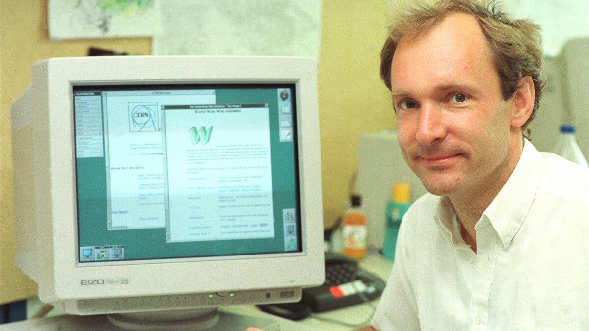
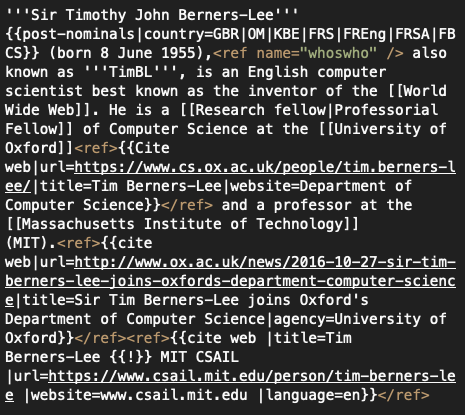
Tim Berners-Lee, inventor of the World Wide Web, in front of the early web.
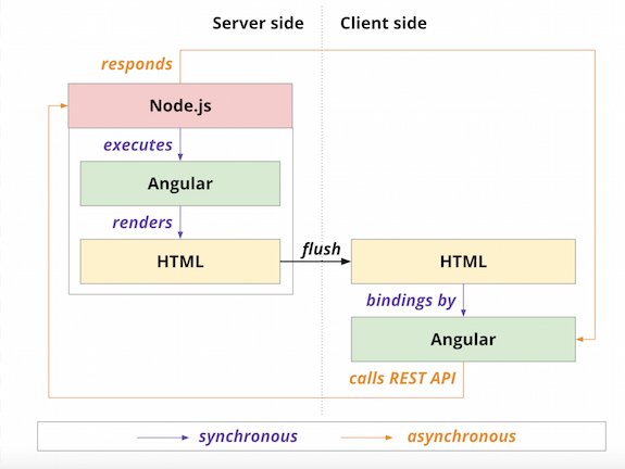
In a universal JavaScript approach utilizing shared rendering, Node.js executes a framework (in this case Angular), which then renders an initial application state in HTML. This initial state is passed to the client side, which also loads the framework to provide further client-side rendering that is necessary, particularly to “rehydrate” or update the server-side render.
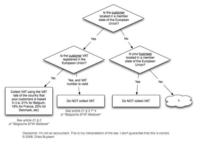
If you have an e-commerce site that sells to international customers, this is how you need the charge VAT.
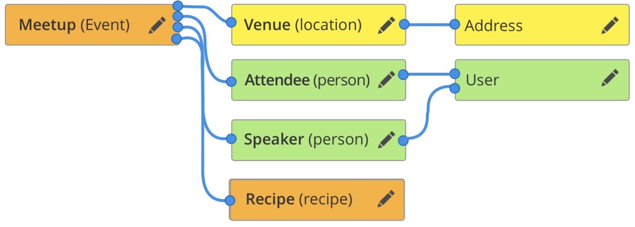
A visual example of an entity graph in Drupal.
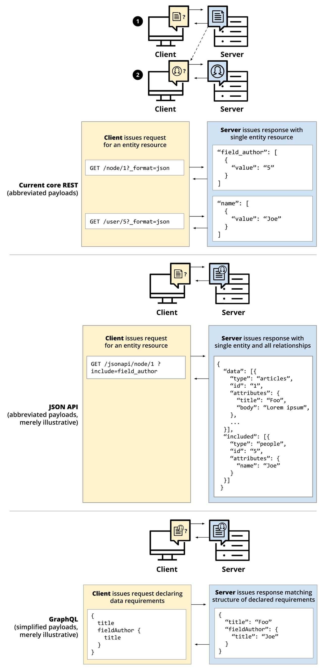
A comparison of different API approaches for Drupal 8, with amended and simplified payloads for illustrative purposes.
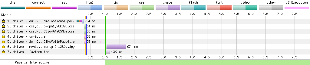
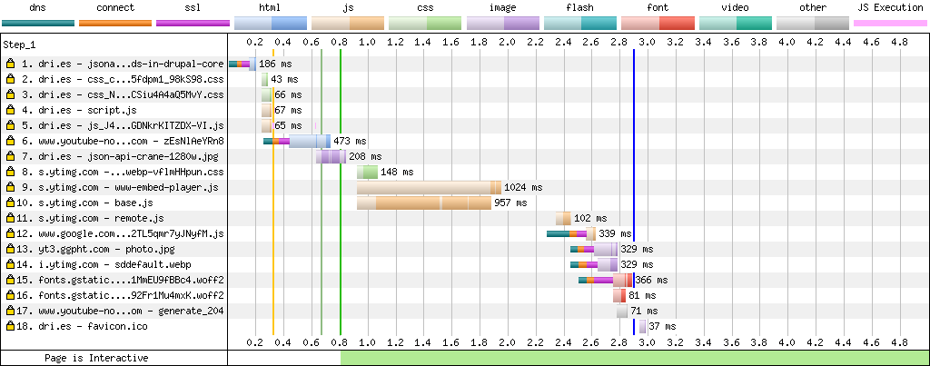
When using youtube-nocookie.com, Google no longer uses DoubleClick to track your users. No HTTP cookie was sent, "only" 18 files were loaded, and the total page load time was significantly faster at 2.9 seconds (vertical blue line). Most of the load time is still the result of embedding a single YouTube video.
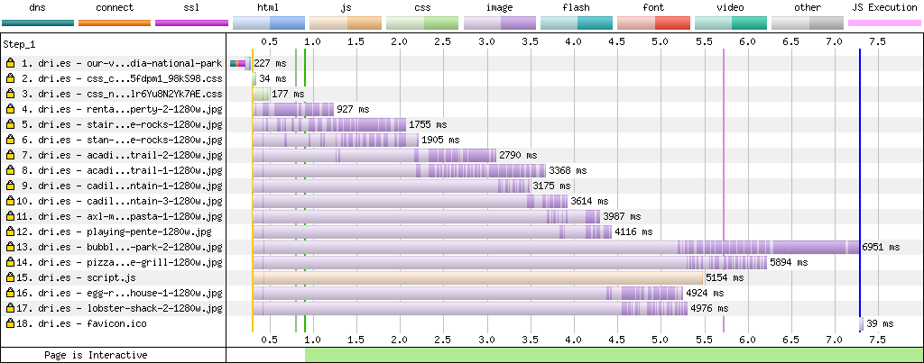
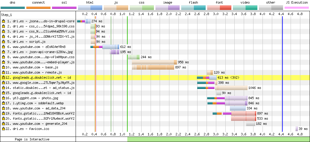
When embedding a video using youtube.com, Google uses DoubleClick to track your users (yellow bar). A total of 22 files were loaded, and the total time to load the page was 4.4 seconds (vertical blue line). YouTube makes your pages slow, as the vast majority of requests and load time is spent on loading the YouTube video.
What the browser sees; the HTML code Wikipedia (MediaWiki) generates.
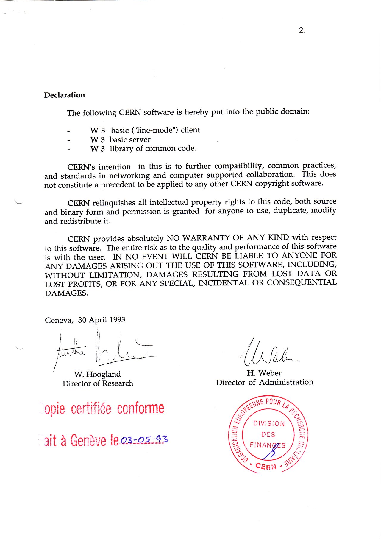
Twenty-five years ago, CERN released the World Wide Web technology into the public domain. Below is the document that officially put the World Wide Web into the public domain on 30 April 1993. I love the "no warranty" disclaimer!
A personalized cover!
Detail shot of an old Shares certificate
Woman framing the future. This is a montage which has a city scape overlaid. Success and vision concept
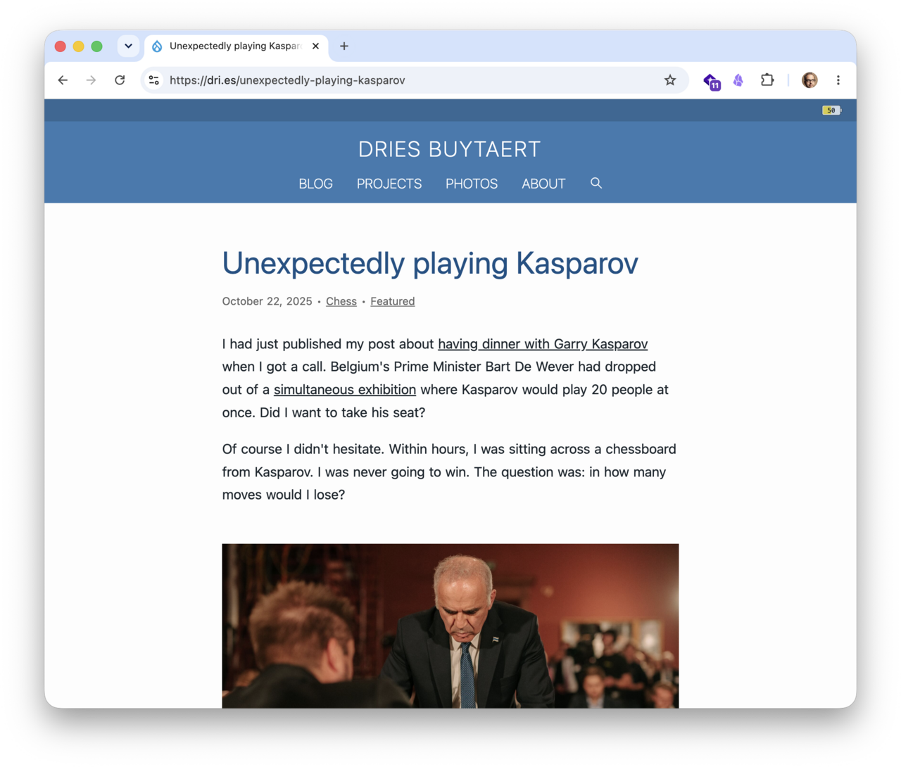
Chess board and pieces in a chess game.
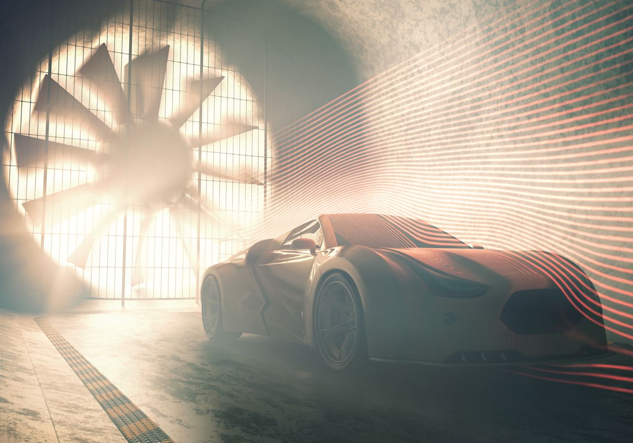
3D illustration, concept car without reference based on real vehicles inside of windtunnel.
coding code program coder programming work write man system web network html human hand key secrecy criminal concept - stock image
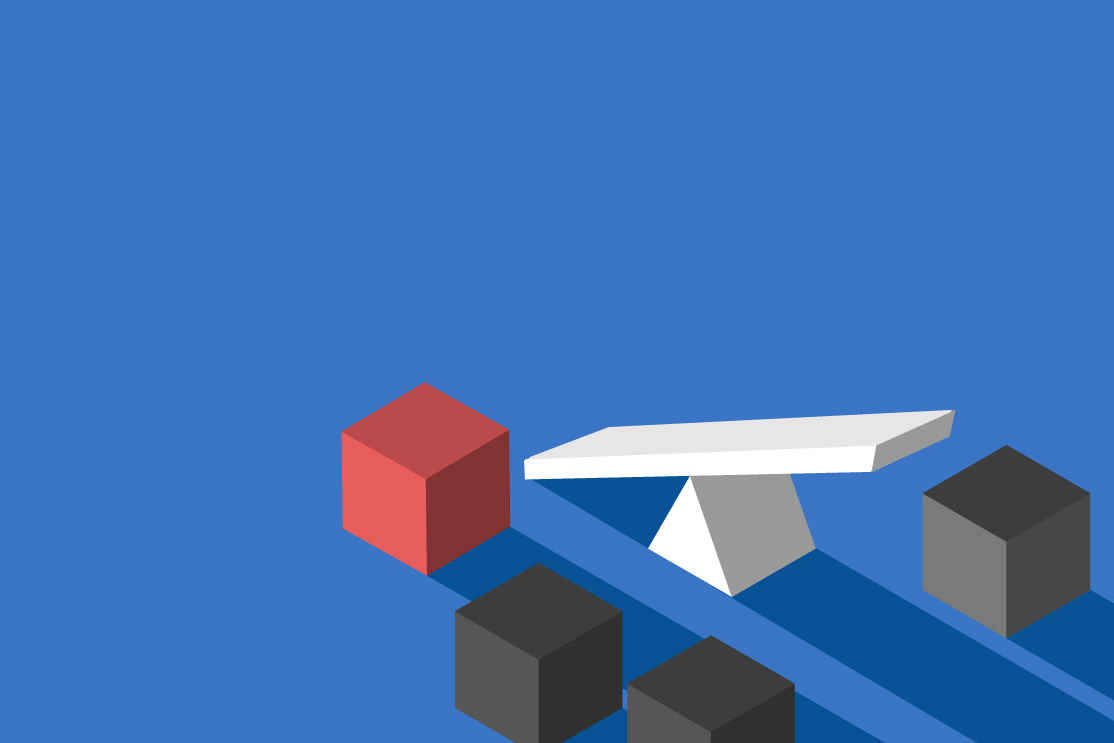
Assebling of a 3D cubic bluilfing blocks structur.
Senior caucasian businessman choking or slowing streaming data in illustration of net neutrality regulations
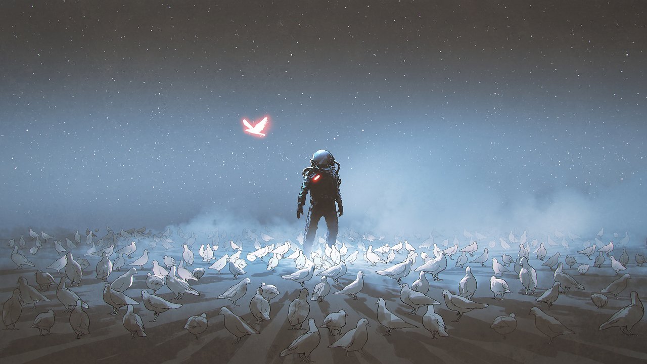
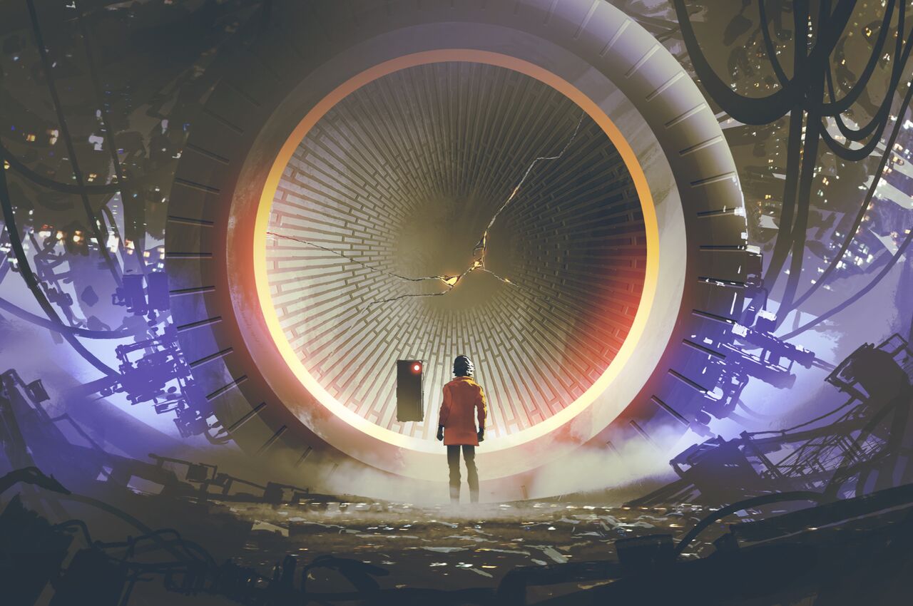
astronaut standing a among flock of bird, single glowing unique bird flying around, digital art style, illustration painting (astronaut standing a among flock of bird, single glowing unique bird flying around, digital art style, illustration painting
The original image that we need to generate a placeholder for.
Before (left) and after (right).
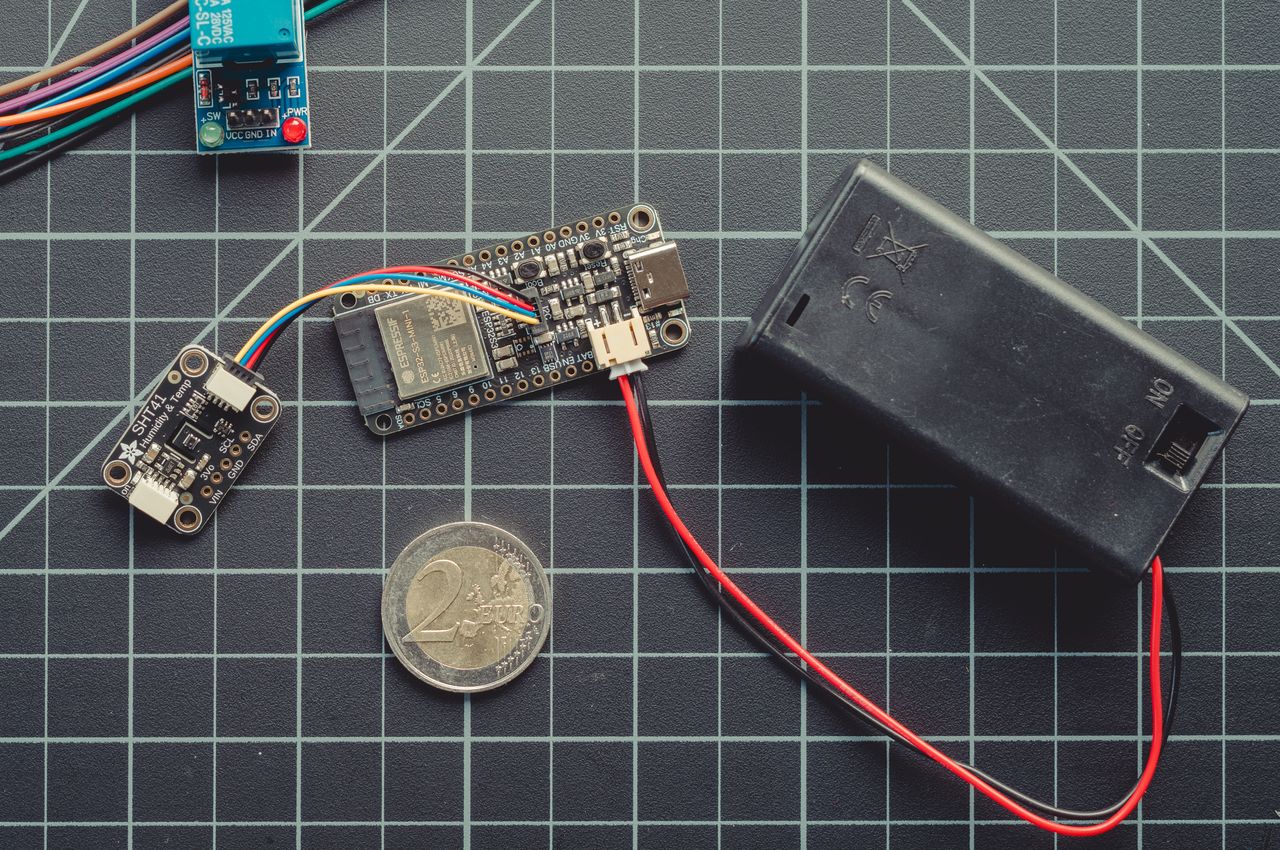
An ESP32-S3 development board (middle) linked to a Sensirion SHT41 temperature and humidity sensor (left) and powered by a battery pack (right).
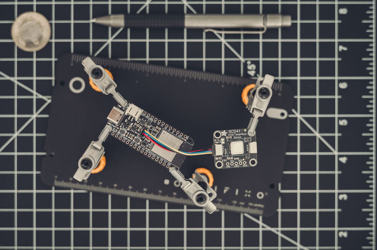
A development board with an ESP32-S3 chip (left) connected to a Sensirion SCD41 sensor on the right, which measures CO2 levels and temperature.
The 12V to 5V voltage converter used to convert the 12V output from the solar panel to 5V for the Raspberry Pi.
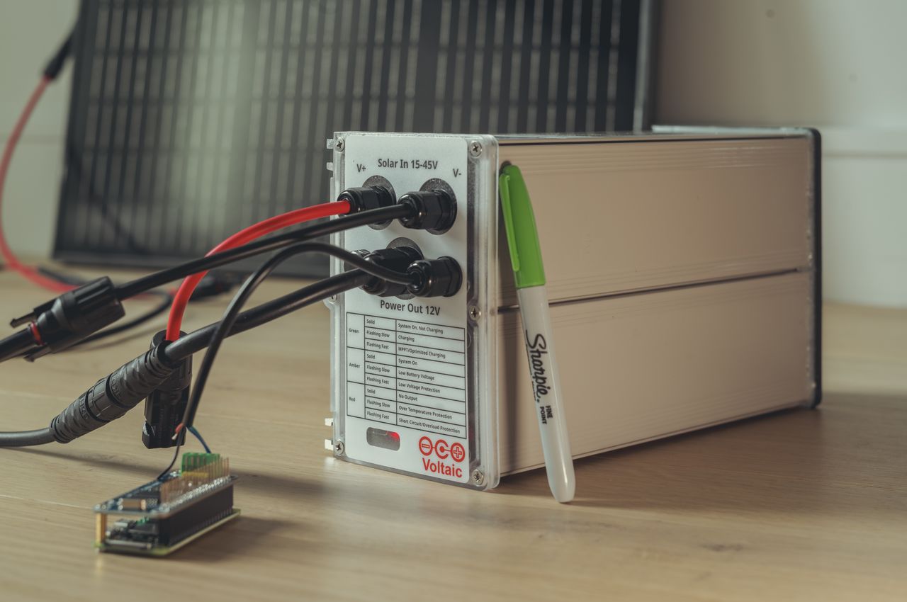
A 18Ah LFP battery from Voltaic, featuring a waterproof design and integrated MPPT charge controller. The battery is large and heavy, weighing 3kg (6.6lbs), but it can power a Raspberry Pi for days.
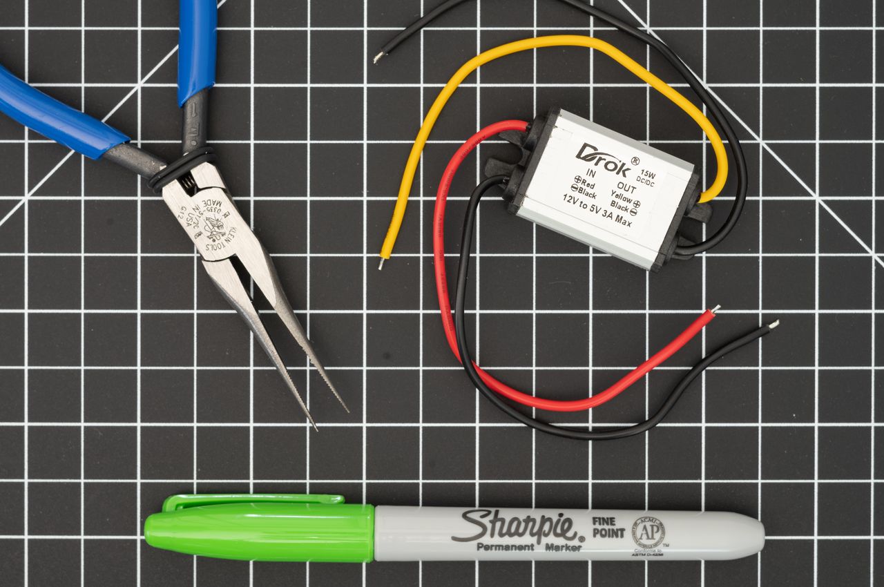
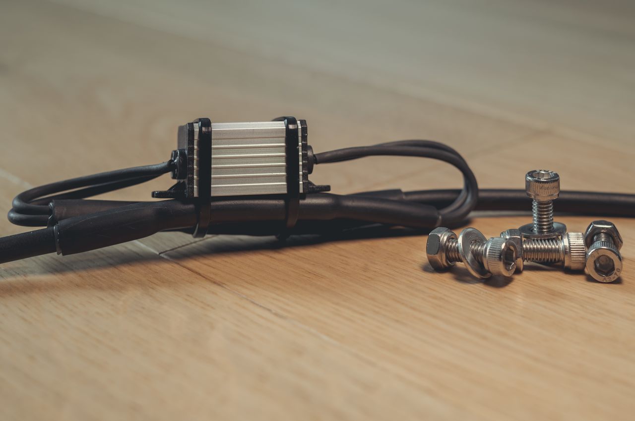
A 12V to 5V buck converter, needed to convert the 12V output from my solar panel to the 5V required by my Raspberry Pi Zero 2. It was integrated by cutting the cable, connecting the converter, and protecting the connections with heat shrink tubing to ensure they are waterproof.
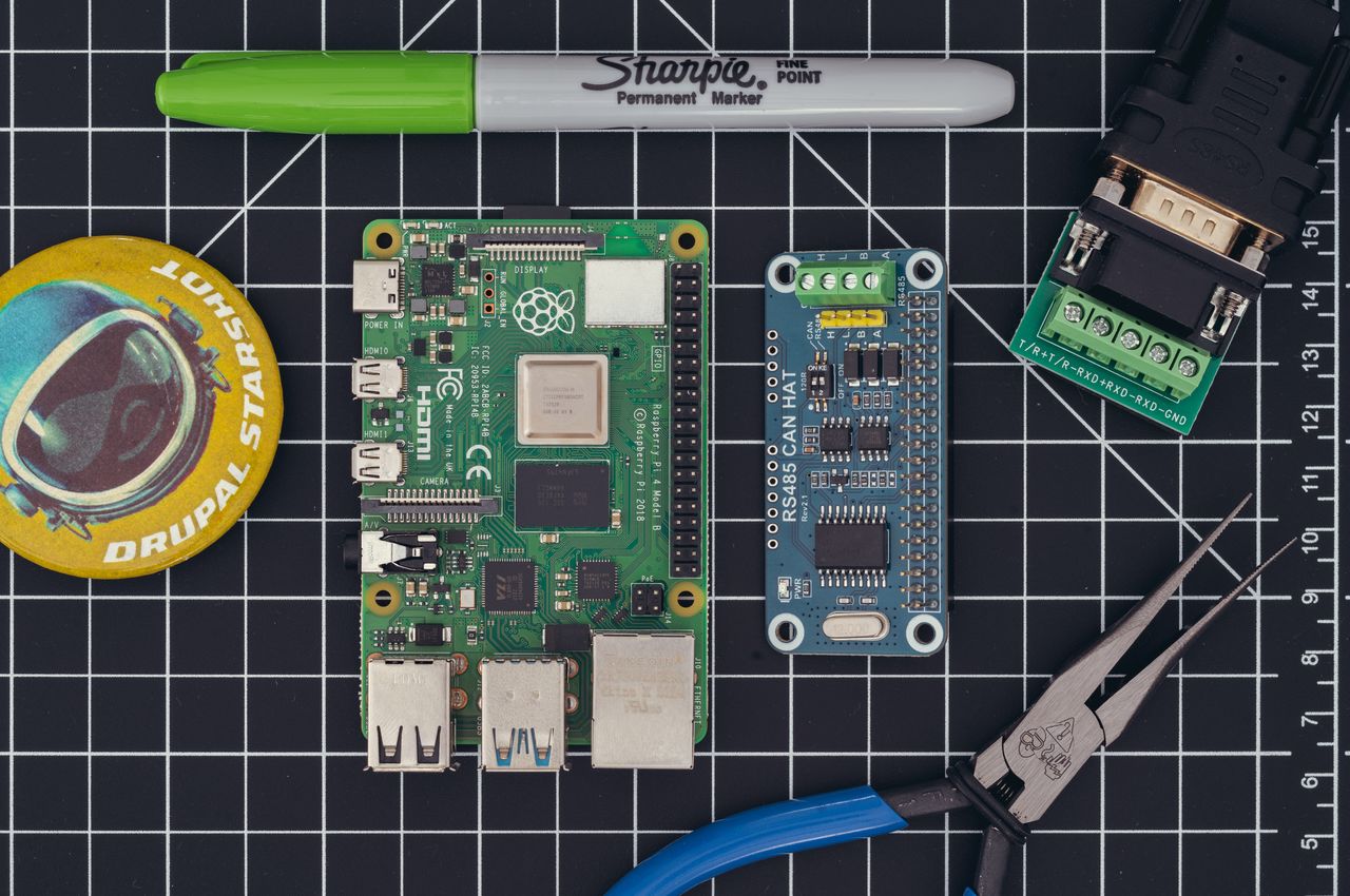
The Raspberry Pi 4 (on the left) can run a website, while the RS485 CAN HAT (on the right) will communicate with the charge controller for the solar panel and battery.
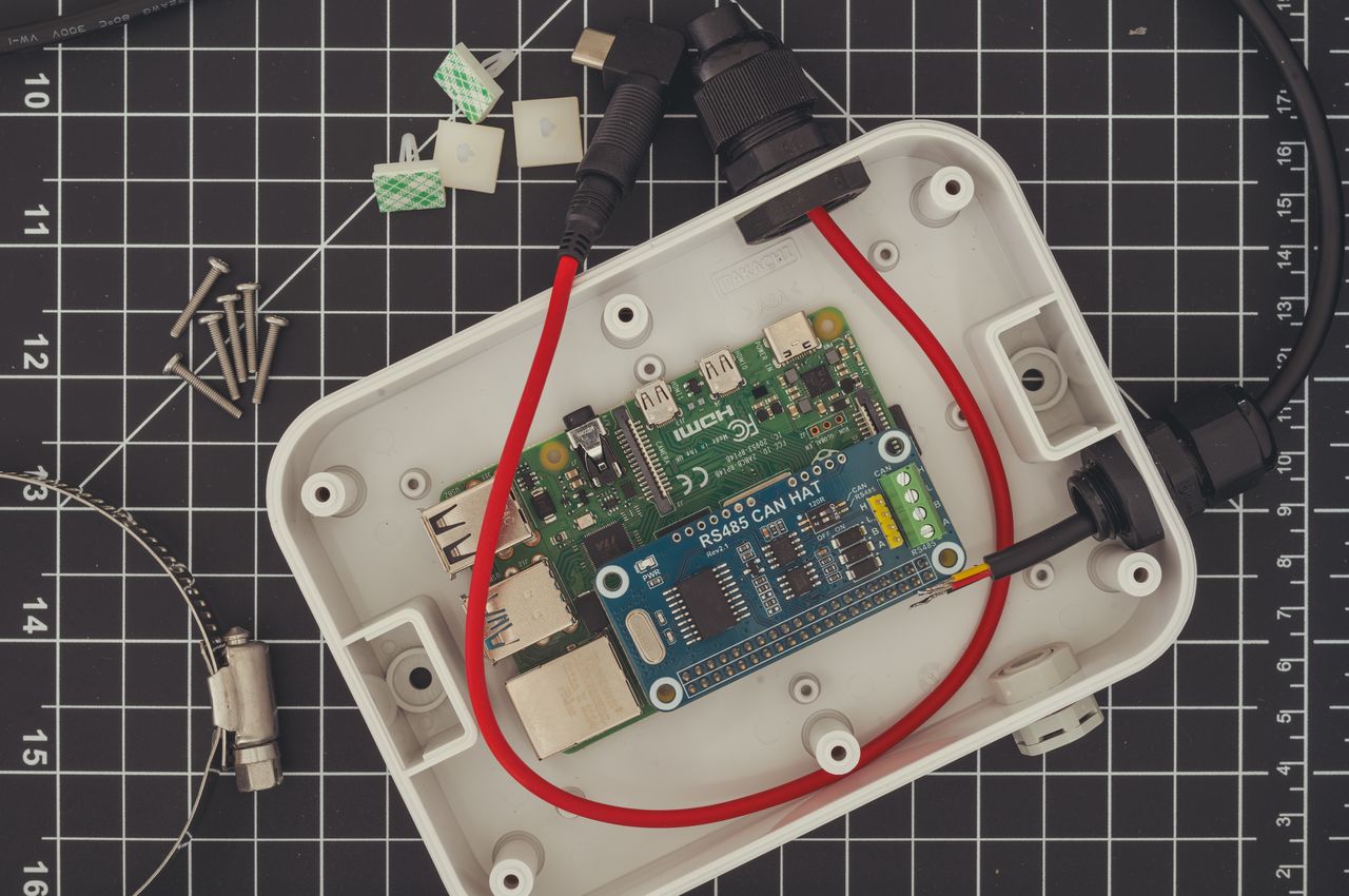
A Raspberry Pi 4 with an attached RS485 CAN HAT module is being installed in a waterproof enclosure.
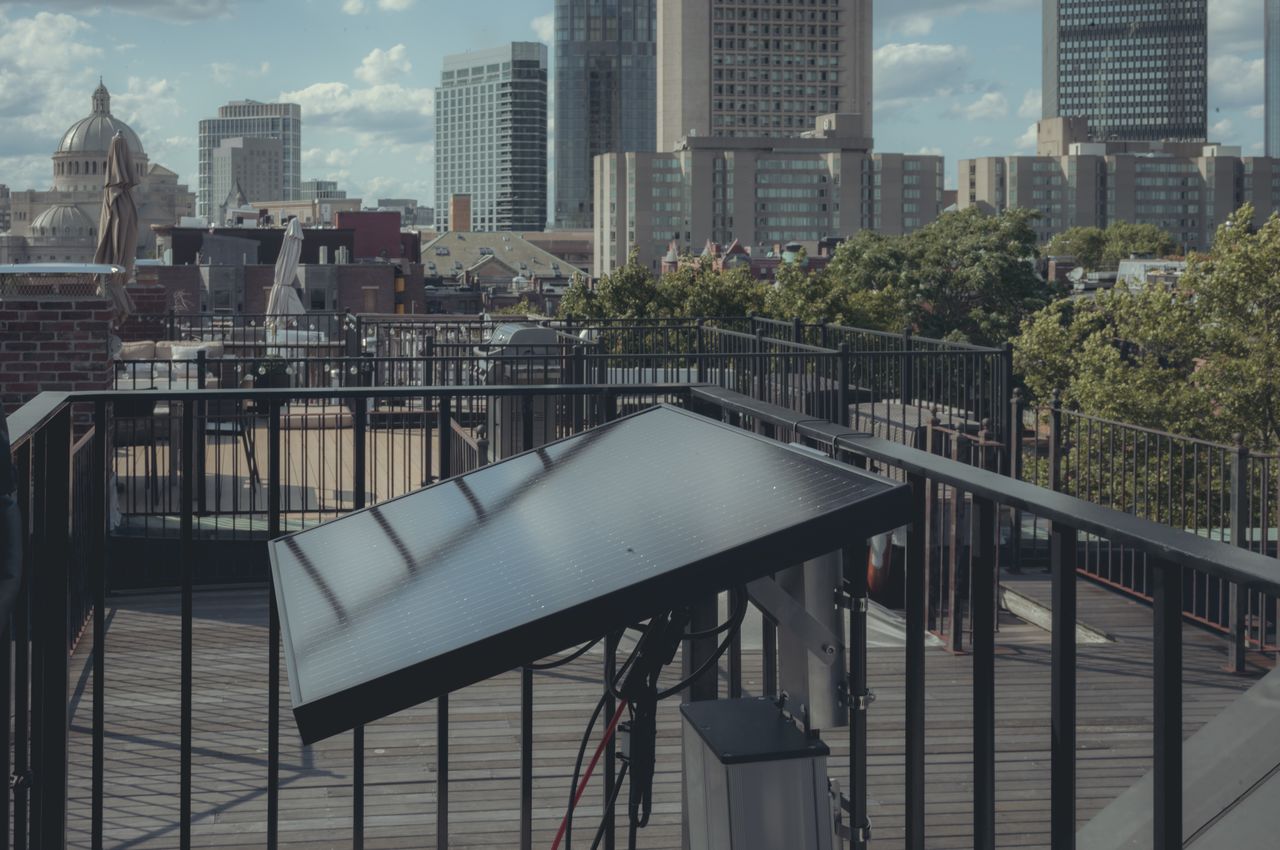
The solar panel and battery mounted on our roof deck.


